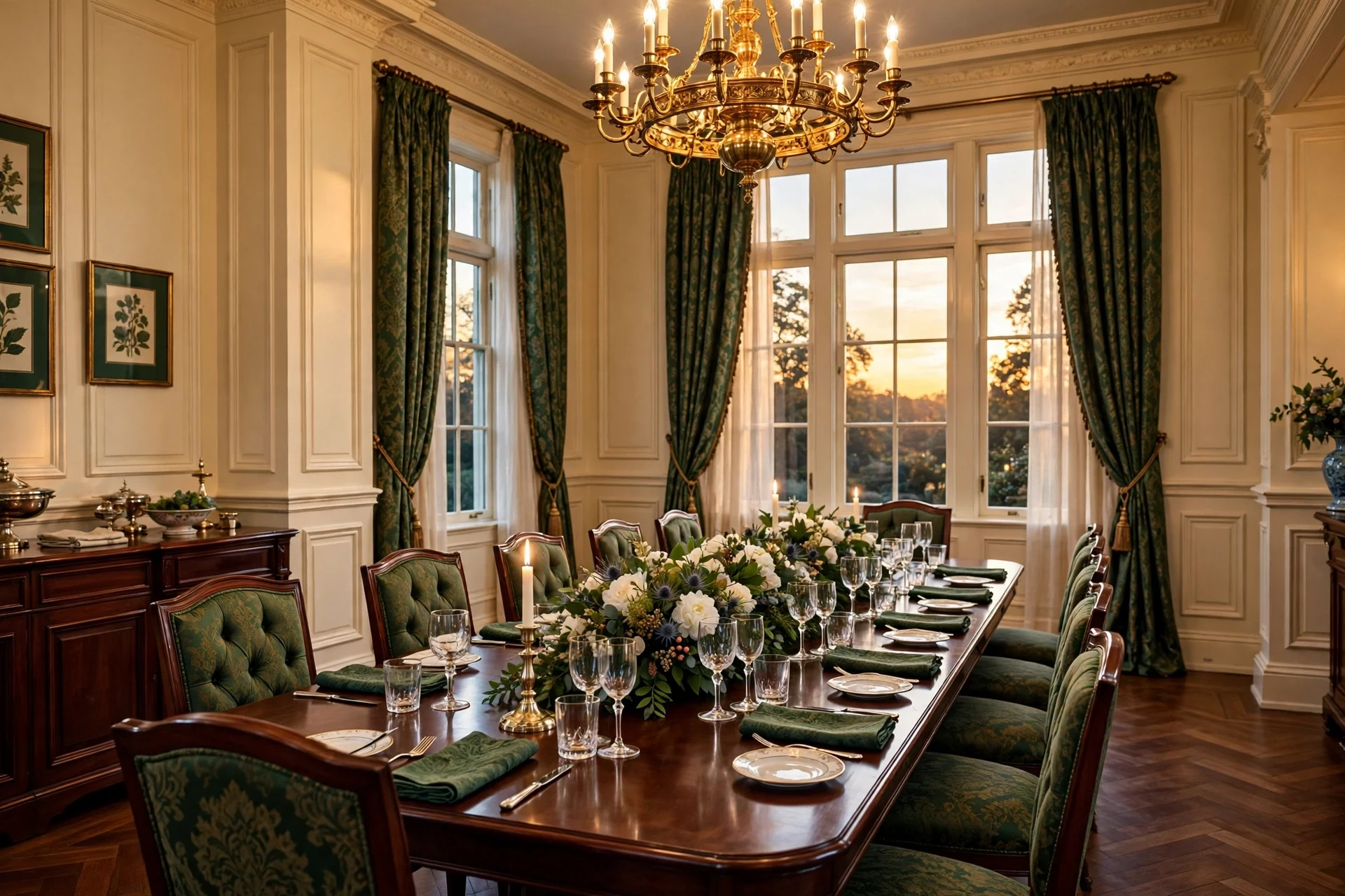
Traditional wainscoting is raised-panel millwork — beveled frames, a sturdy chair rail, and a shaped baseboard — that protects the lower wall while giving rooms the quiet formality of Georgian and Federal interiors. These traditional wainscoting ideas bring you 32 specific ways to use that paneling, from deep forest green dining rooms to cream-paneled foyers and hushed paneled bedrooms. Evening light rakes across the bevels. Unlacquered brass warms to a soft patina, linen curtains soften the geometry, and mahogany holds the room with real weight. It feels settled and certain, the way rooms looked when they were built to last a century. Here are 32 ideas worth saving — and stealing.
Why These Traditional Wainscoting Ideas Work So Well
Traditional wainscoting descends from the oak-paneled great rooms of Georgian England and the raised-panel interiors of Federal America, where wainscot — originally fine oak lining — shielded plaster walls from chair backs and passing shoulders. Unlike beadboard's grooves or board-and-batten's flat strips, traditional wainscoting uses beveled raised panels set inside stiles and rails, a profile with real shadow lines that reads formal rather than rustic. Its DNA is architectural order: baseboard, panel field, chair rail, and often a crown, stacked like classical entablature.
The material palette is specific enough to shop from: paint-grade poplar or MDF for crisp panels, quarter-sawn mahogany for stained libraries, unlacquered brass and polished nickel for hardware and light fittings. Paint colors anchor the look — Benjamin Moore Simply White and White Dove for warm whites, Benjamin Moore Essex Green for deep forest green, Farrow & Ball Hague Blue for true navy, soft creams above the rail. Textiles stay honest: damask, undyed Belgian linen, and wool in tailoring weights.
It is trending now because the quiet-luxury movement has revived appetite for rooms with inherited character, and traditional wainscoting ideas rank among the most saved paneling searches on Pinterest. Homeowners want architecture without structural work, and millwork delivers shadow and depth that flat paint cannot fake. New-build homes are retrofitting chair rails and panel molding to escape the drywall box, while renovators use painted panels as the fastest route to a room that photographs with weight.
Small spaces take it well when panels stay pale and tall. A powder room, narrow hallway, or dining nook gains proportion from stacked rectangles, and a rail set at 36 to 42 inches borrows height by pushing the eye upward. Prioritize the wall you see first and keep molding shallow, under three-quarters of an inch of projection. The honest limit: very dark colors in windowless closets read heavy rather than rich, so save forest green and navy for rooms with real daylight.
| Element | Georgian Heritage | Formal Character |
|---|---|---|
| Philosophy | Order, symmetry | Inherited, not staged |
| Key Materials | Painted poplar, mahogany | Unlacquered brass, linen |
| Key Colors | Simply White, Essex Green | Hague Blue, soft cream |
32 Traditional Wainscoting Ideas
1. Benjamin Moore Simply White Traditional Wainscoting Ideas for a Formal Dining Room
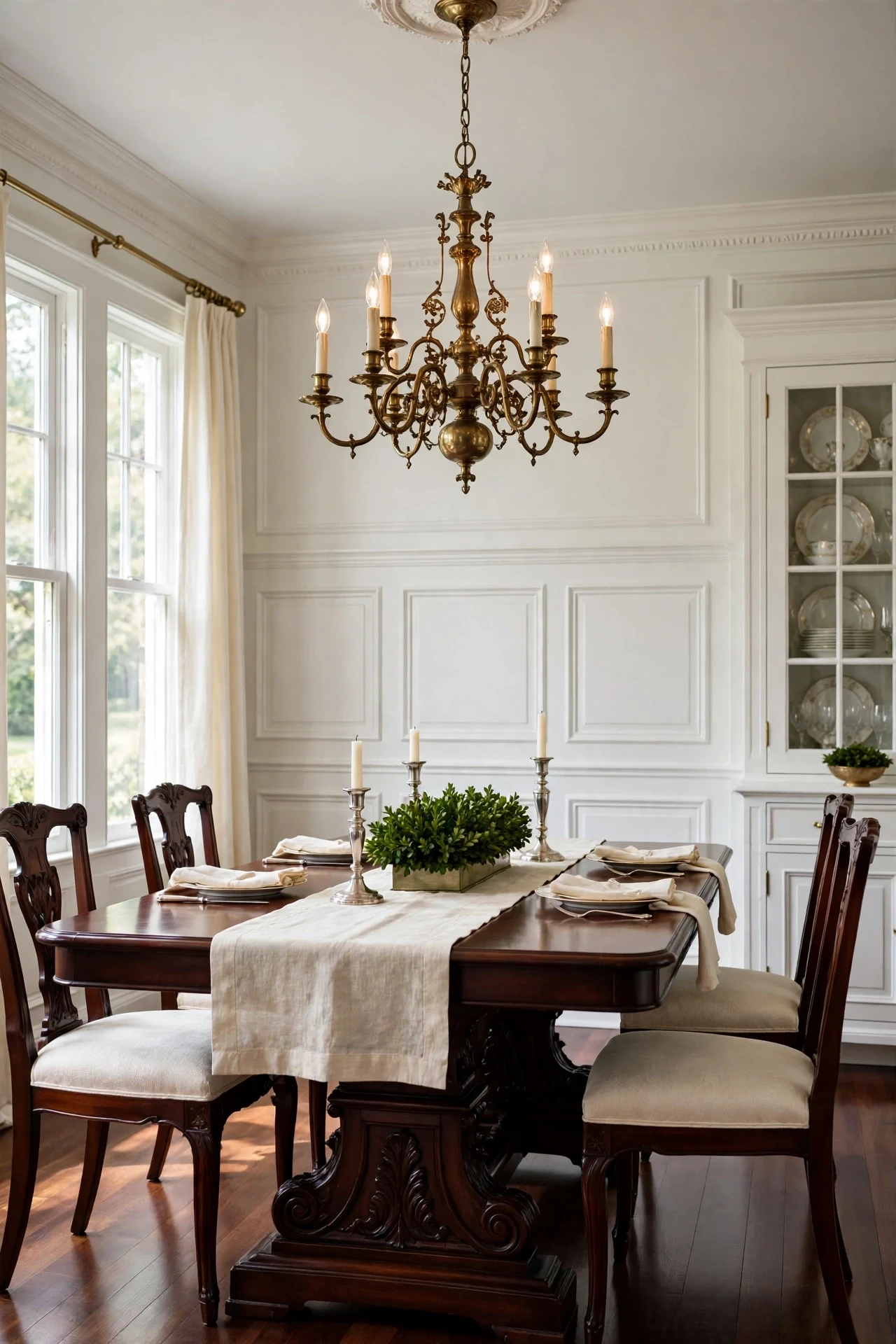
The room feels ceremonial, still, and candle-ready.
White raised panels against a dark mahogany table use contrast the way classical interiors always have — pale architecture, weighted furniture. The bevels catch daylight and model each panel with soft shadow, so the wall reads carved rather than flat.
Paint panels in Benjamin Moore Simply White satin, brushing bevels and rolling flat fields. Sand with 220-grit between two coats for crisp edges. Keep the upper wall one shade softer so the chair rail reads as a deliberate boundary.
2. Mahogany Raised Panels in a Gentleman's Library
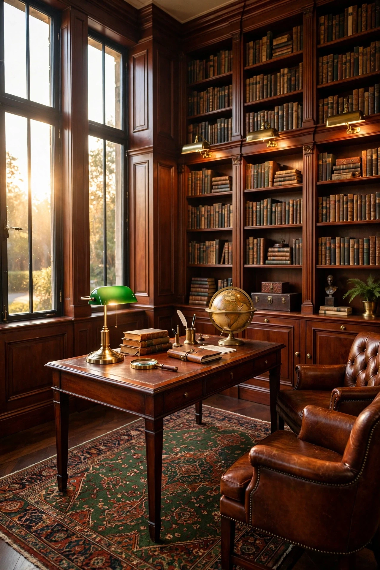
The library feels hushed, weighty, and faintly scented with old paper.
Dark wood wraps the room like a binding, and enclosure made legible makes small rooms feel intentional rather than cramped. Mahogany grain adds texture layering no flat paint can match, so panels read rich in lamplight instead of heavy.
Use quarter-sawn mahogany veneer over paint-grade cores for stability without solid-timber cost, finished with hardwax oil for a hand-rubbed sheen. Keep upper walls a warm putty so dark panels stop at the rail. Align bookcase uprights with panel stiles for one rhythm.
💡 Quick Win: Rub existing dark trim with beeswax polish this weekend to fake the hand-rubbed sheen before committing to new panels.
3. Candle-Style Sconces Grazing the Panels of a Dining Room
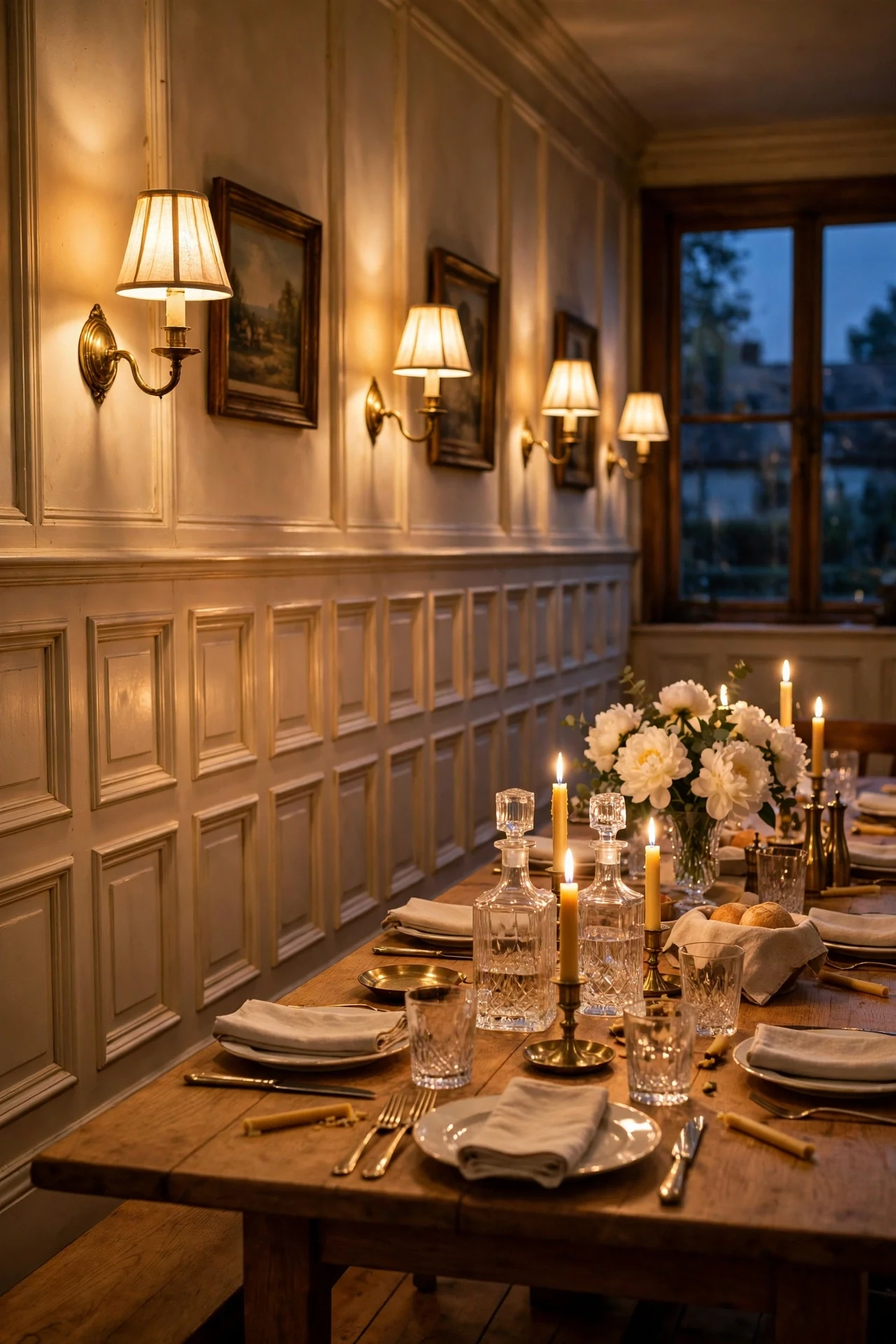
The dining room feels flickering, intimate, and centuries old.
Sconces at face height throw grazing light across the bevels, exaggerating every shadow line so shallow molding gains real depth. Repeating sconces on the panel rhythm creates symmetry, which the eye reads as order and calm.
Mount hardwired candle-style sconces sixty-six inches high, centered over panel stiles for even shadows. Choose unlacquered brass arms with small linen shades. Put them on a separate dimmer from the chandelier for true candlelight levels.
4. A Breakfront Cabinet Framed by Matching Panel Molding
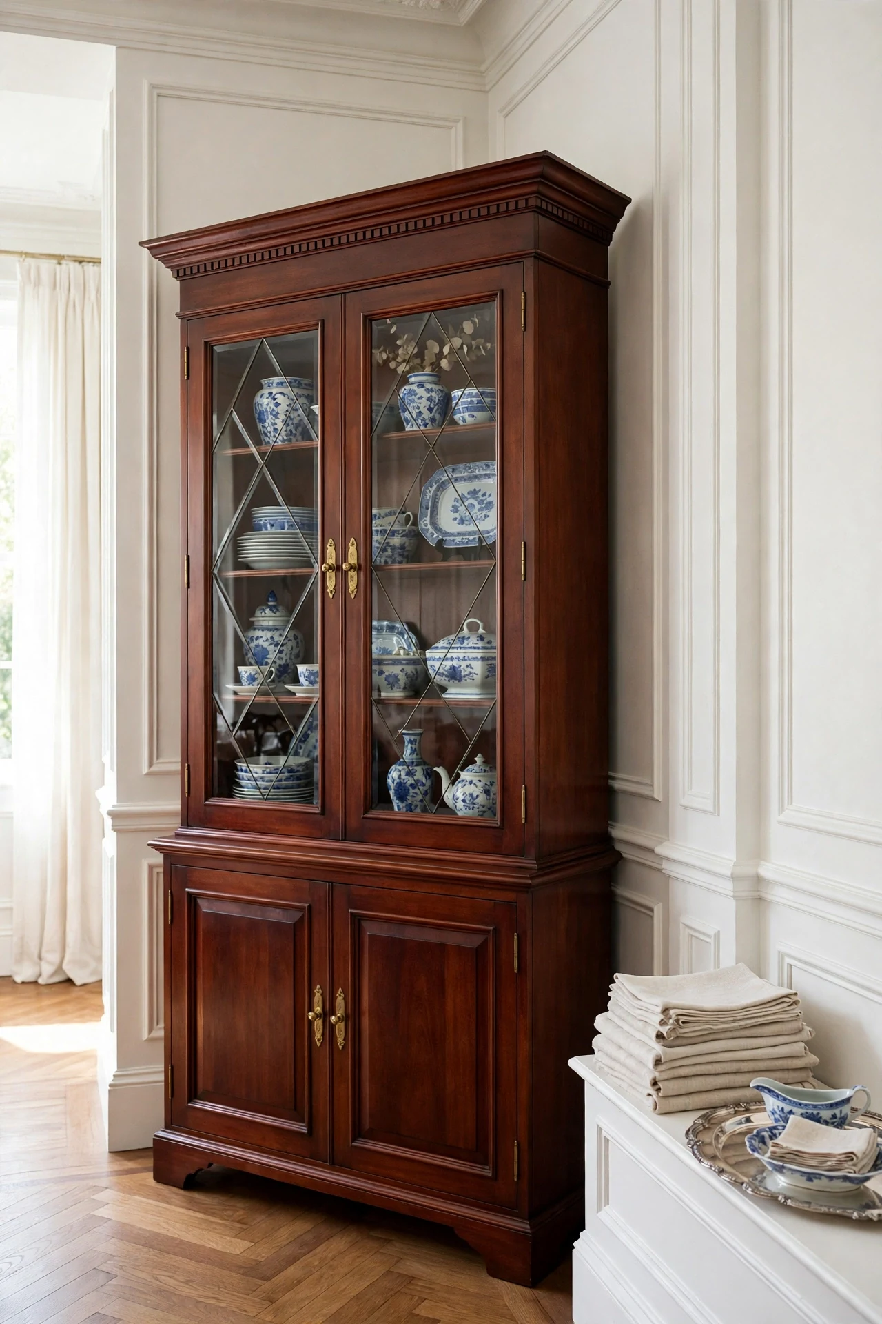
The corner feels collected, heirloom, and quietly orderly.
Framing casework with the wall's molding profiles unifies furniture and architecture, so a breakfront reads built-in rather than delivered. The cabinet crown echoes the chair rail and the door stiles echo the panel stiles — repetition that settles the whole composition.
Apply paint-grade molding strips to the cabinet's face frame, mitered to match your panel proportions. Paint cabinet and wall panels one color so they read as a single piece. Set it where two paneled walls meet, crown aligned with the chair rail.
💡 Quick Win: Paint one freestanding cabinet to match your panels this weekend and watch it suddenly look built-in.
5. Damask Paper Above the Chair Rail
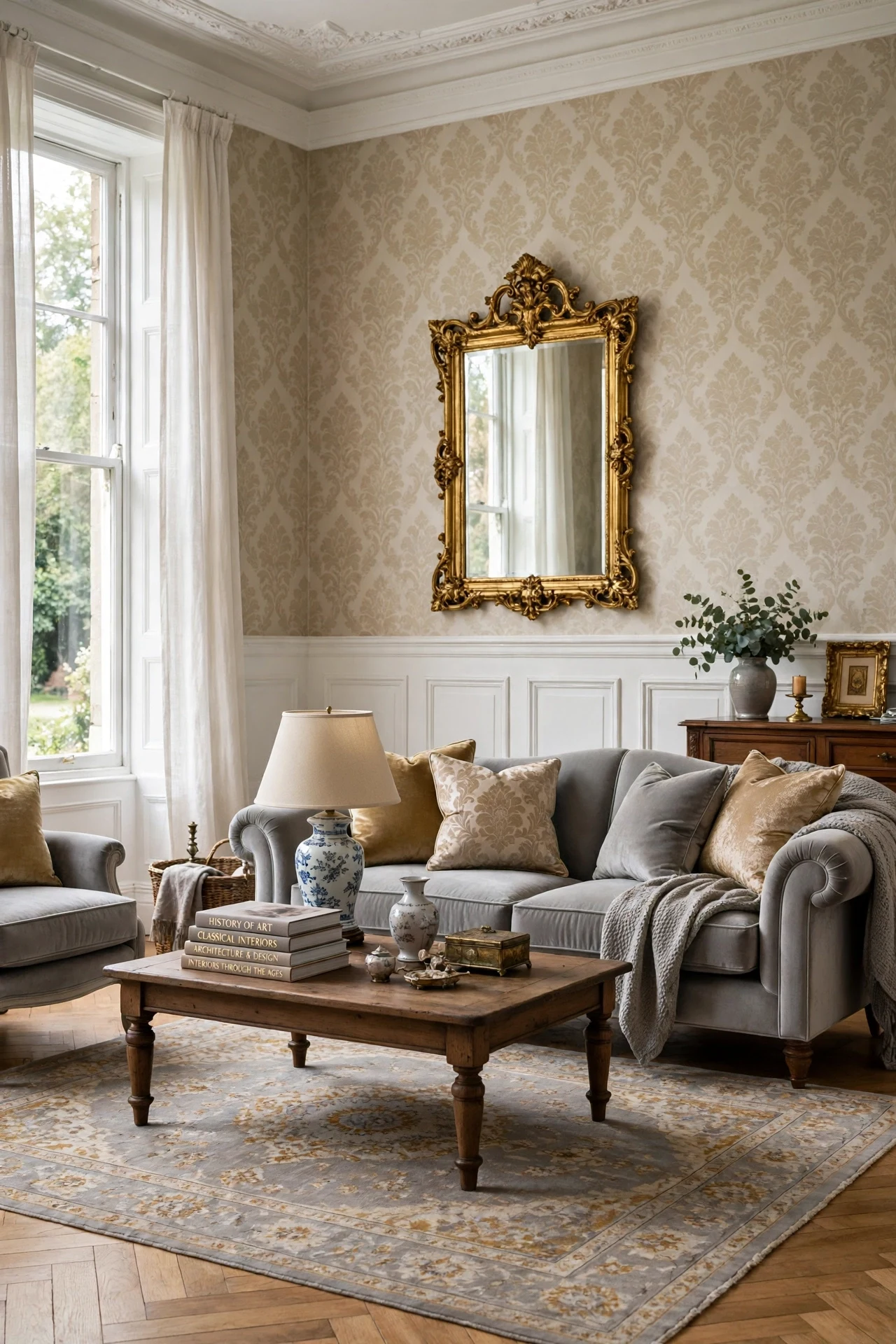
The room feels patterned, historic, and plush underfoot.
Damask above the rail and plain panels below contrast texture rather than color — pattern where the eye rests, calm where chairs make contact. The wallpaper's small repeat echoes the panel rhythm, a nesting of geometries that feels inherited rather than decorated.
Hang tone-on-tone damask in champagne or oyster above the rail; paint panels below in a solid pulled from the paper's background. Cut the paper cleanly at the rail cap so the molding becomes the border. Reserve this for living and dining rooms, not hallways.
6. Deep Forest Green Panels in a Dining Room
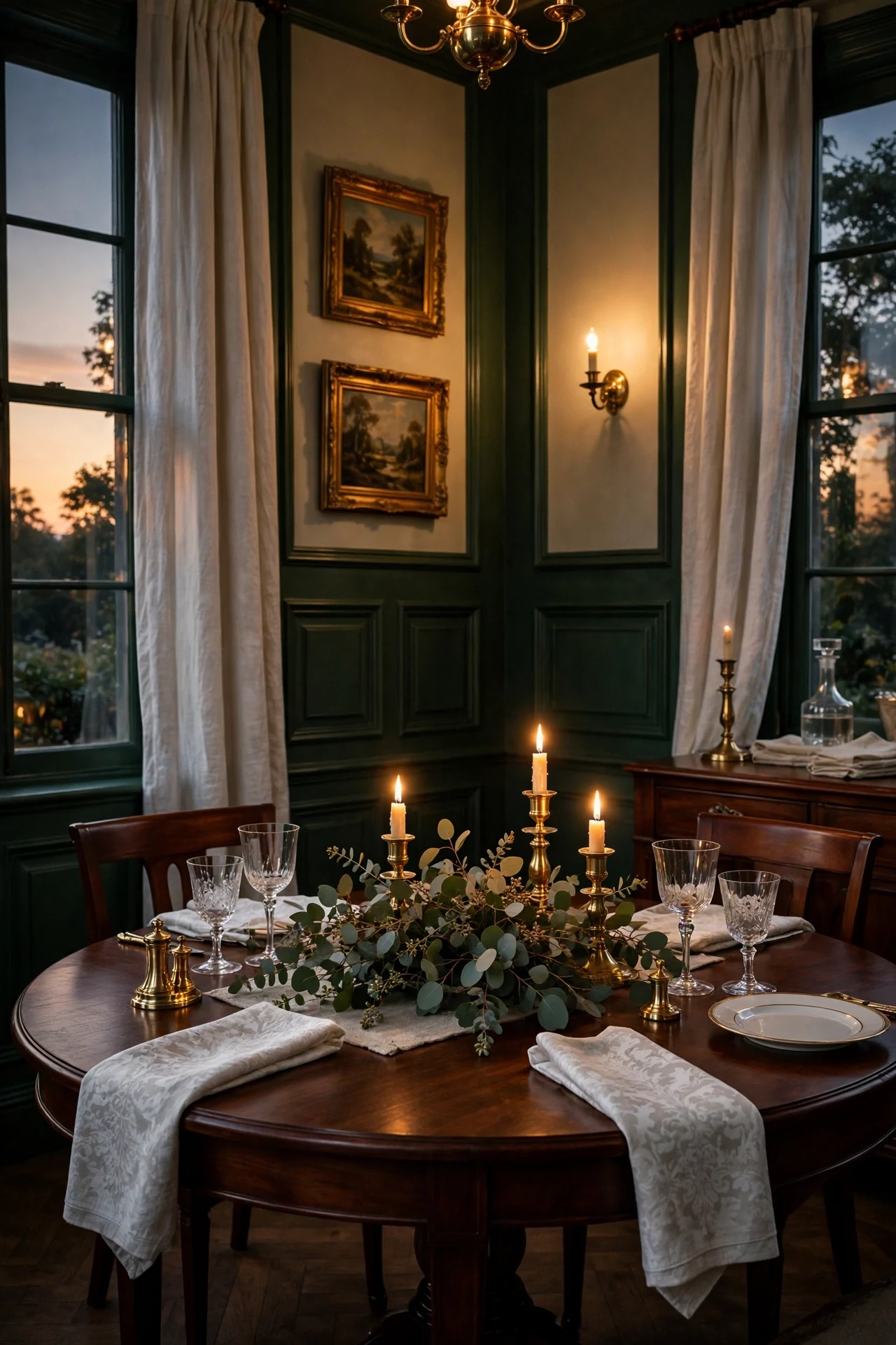
The dining room feels moody, enveloping, and made for long dinners.
Deep green recedes like a garden at dusk, pulling walls back while candlelight advances — a push-pull that makes the room feel larger and more intimate at once. Dark panels concentrate visual weight low, grounding the table, while brass repeats as warm punctuation.
Roll Benjamin Moore Essex Green in satin; the sheen keeps dark panels lively under lamplight where flat paint would die. Carry the green onto a serving alcove or shelf backs for depth. Keep ceiling and upper walls warm white so the room holds its light.
💡 Quick Win: Paint just the wall behind your sideboard forest green this week to test the drama before committing the whole room.
7. A Dentil Crown Stacked Over the Chair Rail
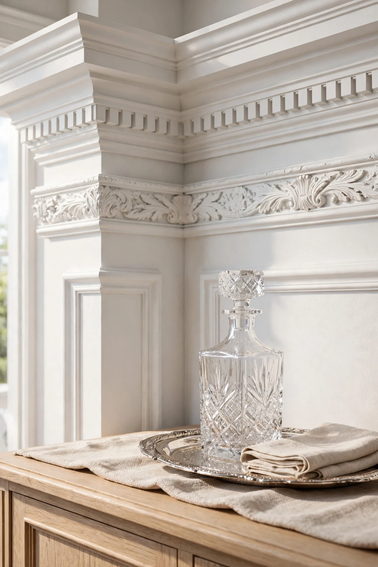
The corner feels crisp, tailored, and exactingly built.
Stacked molding borrows the classical entablature — base, shaft, capital — giving the wall a beginning, middle, and end. The dentil blocks add a small repeating rhythm that rewards close looking, the detail separating custom millwork from flat trim.
Build the stack from stock profiles: a three-inch chair rail, dentil strip, and small cove crown, all in paint-grade poplar. Cope inside corners so seasonal movement never opens a gap. Paint the stack one satin white and caulk every joint.
8. Picture Lights Washing a Paneled Hallway
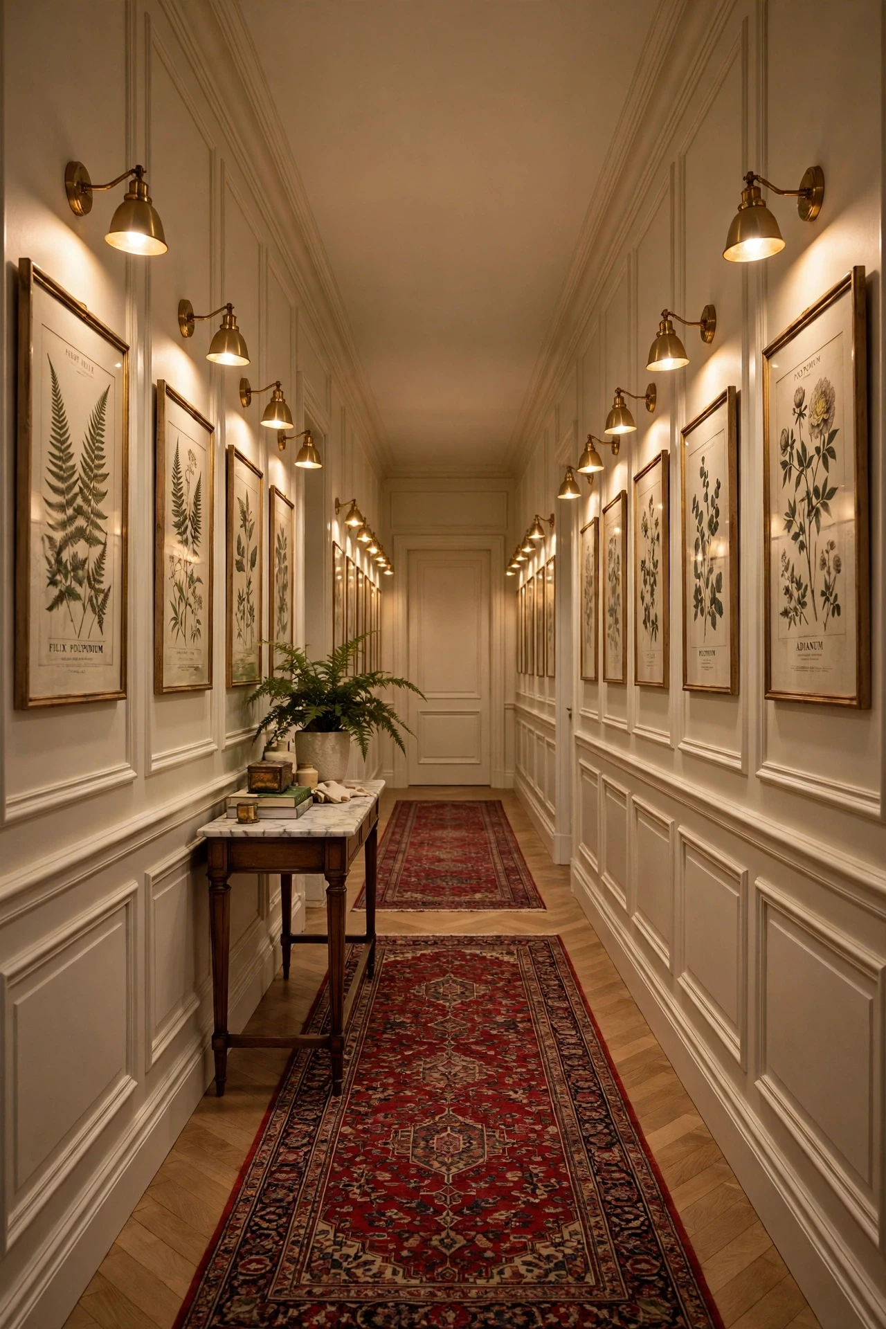
The hallway feels hushed, gallery-like, and worth slowing down for.
Repeating pools of warm light create rhythm, the same principle as the panels below, so architecture and lighting move in one meter. Each picture light models the bevels beneath it with raking warmth, turning a pass-through into a destination.
Fit slim battery LED picture lights above each framed print, one per panel box at sixty inches to center. Choose 2700K with high color-rendering index so wood tones stay honest. Rechargeable fixtures with remote dimmers need zero wiring.
💡 Quick Win: Hang one battery picture light over your best frame tonight and see how the panels wake up beneath it.
9. A Window Seat Set Into a Paneled Bay
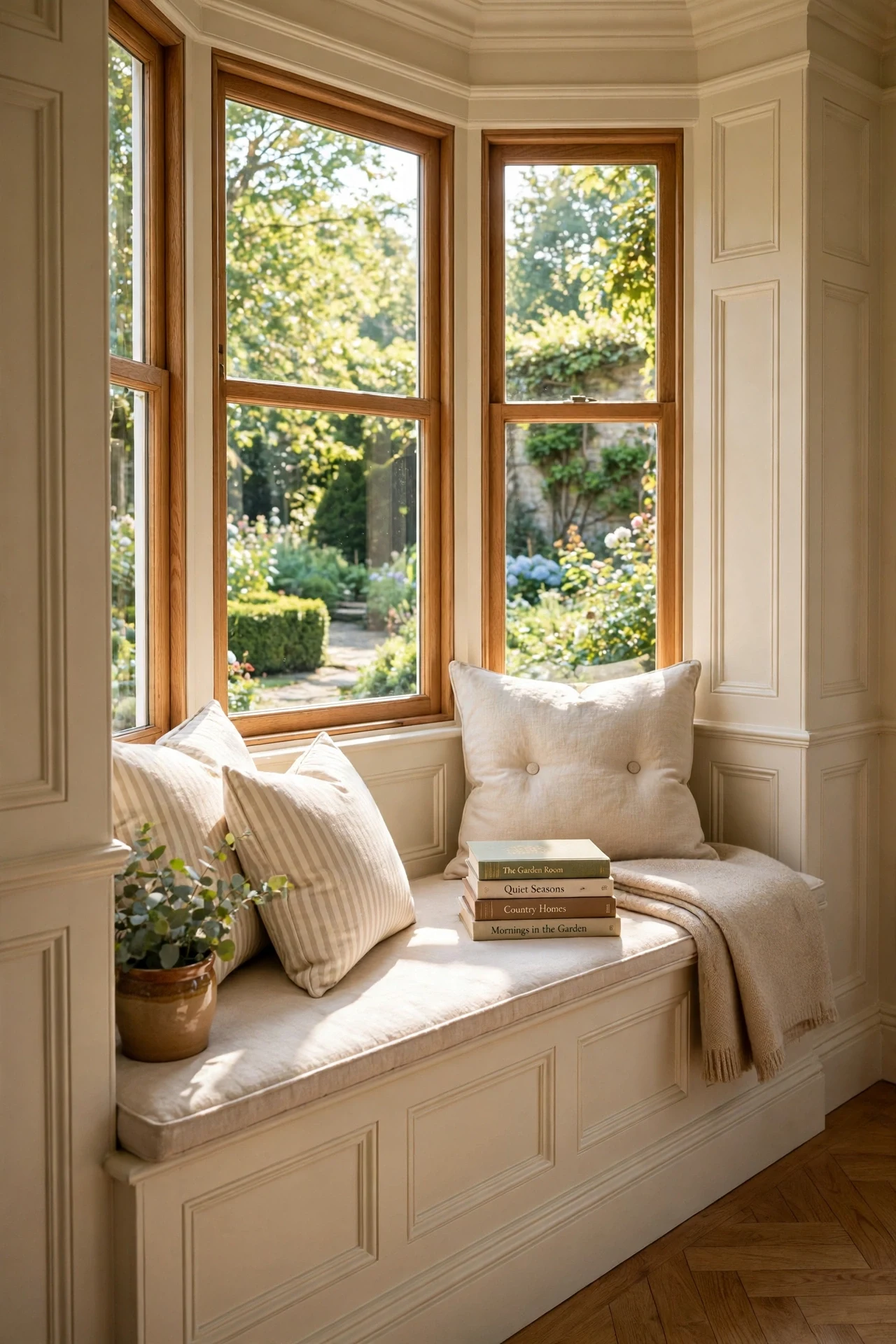
The bay feels sun-warmed, settled, and made for slow mornings.
Setting the seat into the panel field turns a window recess into architecture — furniture and wall as one continuous gesture. Panel fronts on the seat base repeat the wall rhythm at sitting height, while negative space above the cushion keeps the bay airy.
Build the seat eighteen inches high with a hinged top for blanket storage, cladding the front with your wall's raised-panel molding. Miter corners so boxes wrap continuously around the bay. Finish in one satin white with a four-inch linen cushion.
10. An Antique Brass Sconce Gallery Over Paneled Boxes
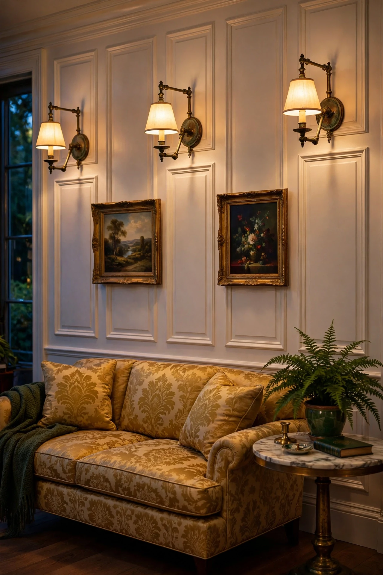
The wall feels gleaming, warm, and deliberately collected.
One sconce per panel box ties lighting to architecture with strict symmetry, and the eye reads that discipline as calm. Unlacquered brass develops a patina that deepens with touch, so fixtures age the way the room aspires to — gracefully.
Space swing-arm brass sconces evenly, one centered over each panel box, wired to a single dimmer. Let the brass go unlacquered and unpolished so time builds the finish. Hang small oil paintings between sconces at sixty inches to center.
💡 Quick Win: Swap one pair of existing sconce shades for aged-brass swing arms to test the patina look in your room.
11. Panels That Mark Where the Foyer Ends and Dining Begins
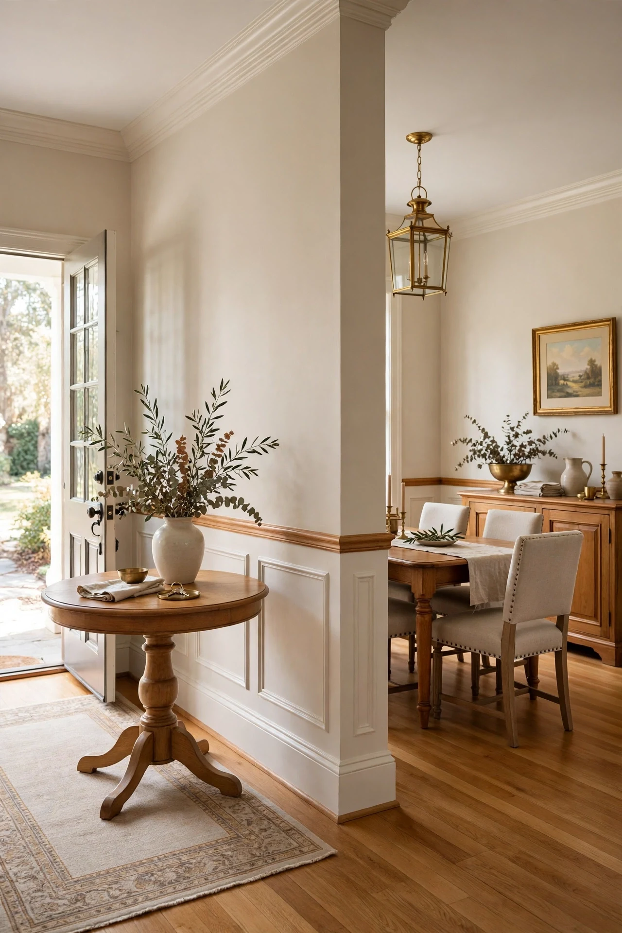
The space feels open yet anchored, flowing without blurring.
A continuous chair rail wrapping the shared wall creates a single datum line — an architectural horizon that zones dining without one partition. Stopping panels at the rug's edge aligns architecture with furniture, so the boundary reads intentional from every angle.
Run wainscoting along the wall both zones share, keeping the rail at one consistent height throughout. End panels where the dining rug ends, returning the rail into the wall with a clean mitered cap. Hang one brass lantern on the foyer side to mark the threshold.
12. Navy Traditional Wainscoting Ideas for a Cozy Library
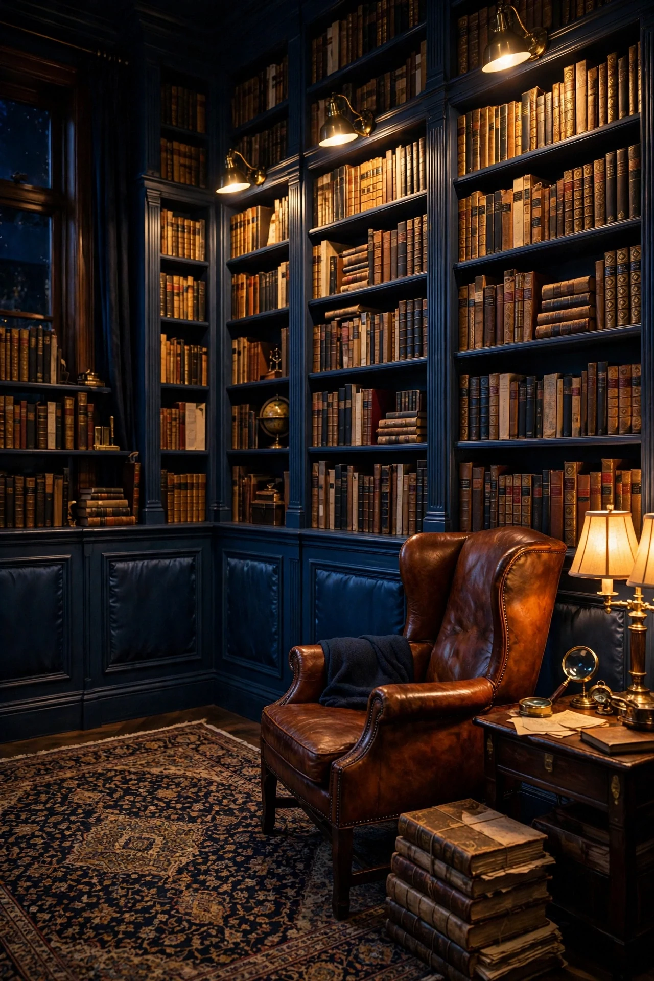
The library feels inky, cocooning, and built for winter evenings.
Navy panels recede like night water, pulling walls back while brass and gilt advance — a depth trick that makes a small library feel boundless. The dark field concentrates visual weight low, which reads as shelter, the quality every reading room needs.
Paint panels in Farrow & Ball Hague Blue satin, carrying the color onto bookcase backs for one continuous field. Mount a brass library light above the main shelves to rake warm light across spines and bevels. Keep upper walls a soft parchment.
💡 Quick Win: Paint the inside backs of one bookcase navy this weekend and watch your books suddenly look collected.
13. Unlacquered Brass Hardware on Paneled Doors
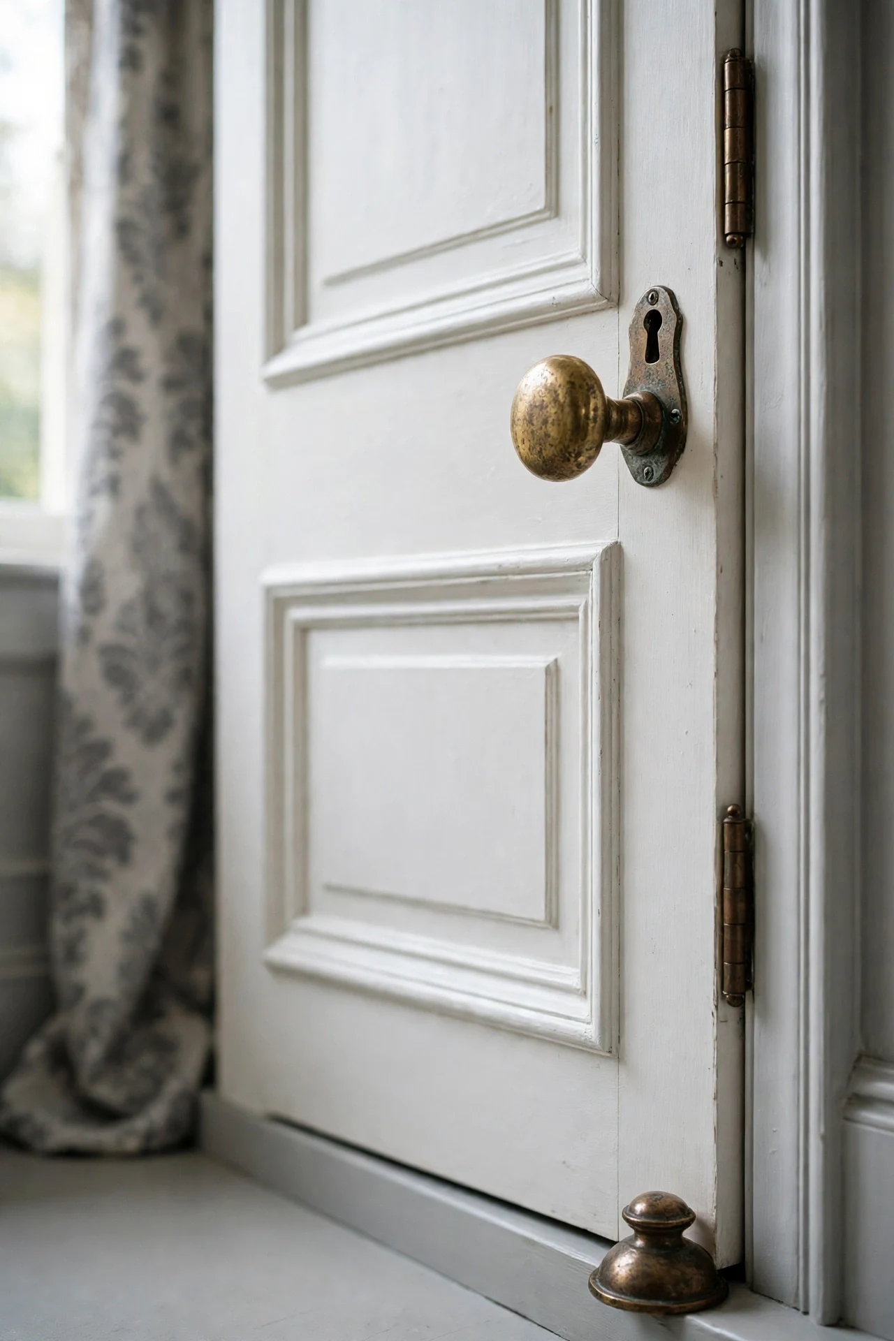
The door feels patinated, warm, and touched by real hands.
Unlacquered brass is a living finish — it darkens where fingers land and stays bright at edges, recording the household's habits in metal. Against crisp white panels that warmth reads as jewelry, the small bright contrast keeping pale rooms from feeling clinical.
Swap knobs, hinges, and escutcheons for solid unlacquered brass in one consistent profile through the whole floor. Never polish; wash with mild soap and let patina build over months. In bathrooms choose lacquered brass, since steam spots the living finish.
14. A Crystal Chandelier Over a Staircase of Panels
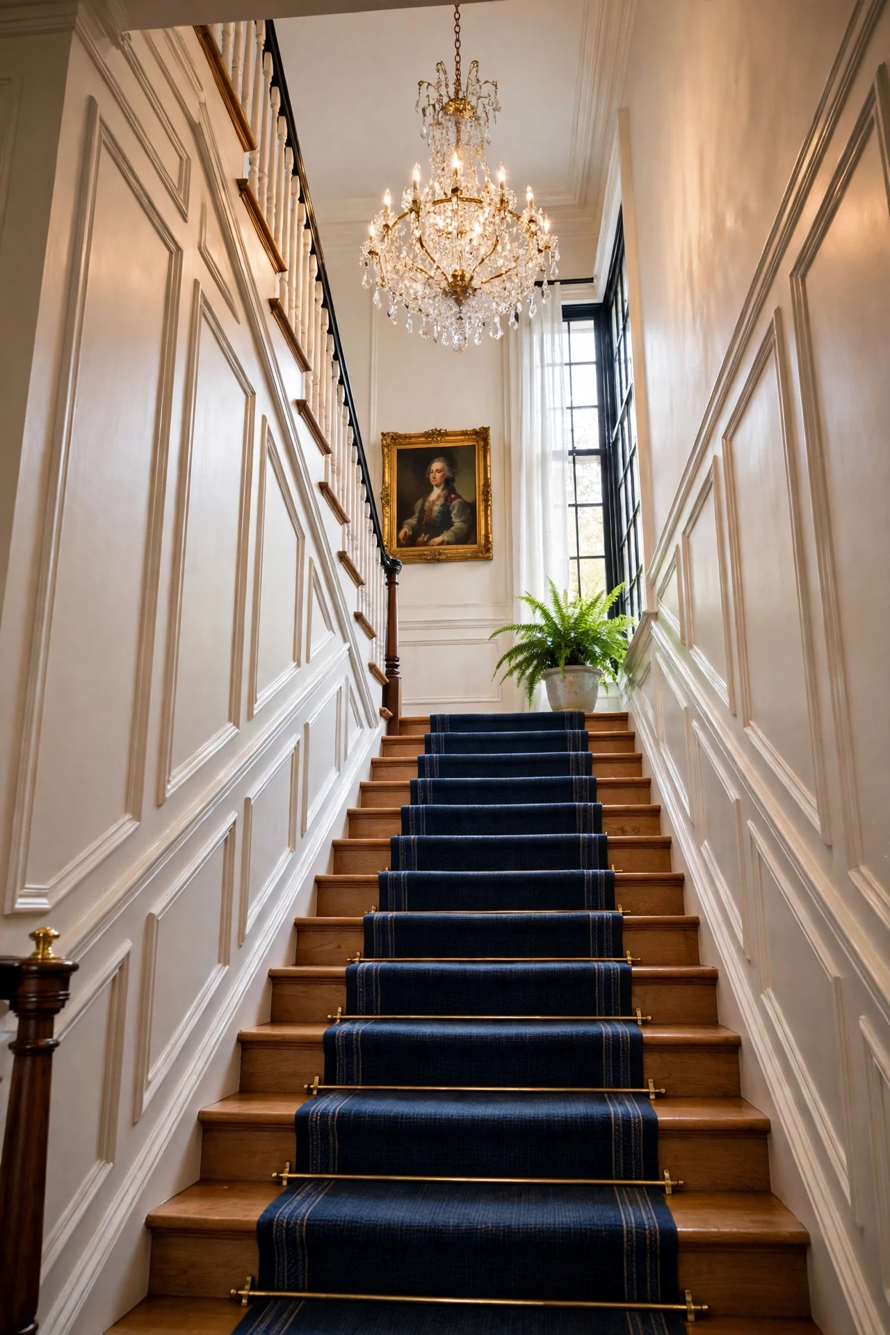
The stairwell feels sparkling, grand, and made for descents.
A chandelier in the stair void throws light up and down the paneled rake, so every bevel catches a moving highlight as you climb — light as theater. Crystal's sparkle against matte panels is the texture contrast keeping formality from stiffening.
Hang the chandelier so its lowest crystal clears the tallest walker by seven feet, centered in the void. Choose real crystal over glass for prismatic throw. Wire to a dimmer and add small sconces on landings so the stair reads as processional.
💡 Quick Win: Clean one existing chandelier crystal-by-crystal with vinegar water and watch the whole stairwell brighten.
15. Built-In Bookshelves Flanked by Paneled Returns
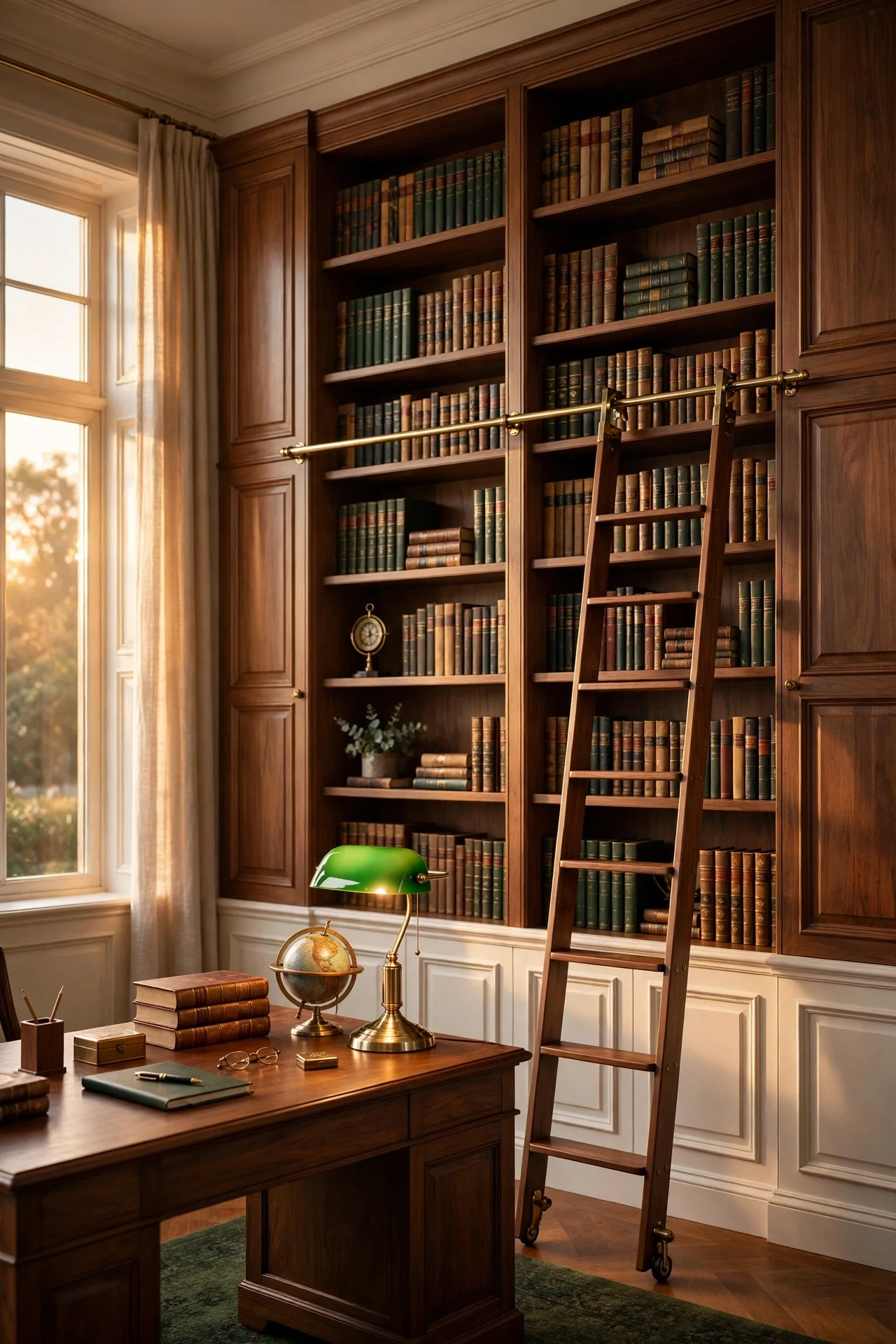
The study feels intentional, tailored, and permanently settled.
Flanking shelves with paneled returns turns bookcases into architecture — side panels act as pilasters, giving the composition classical order. Aligning shelf uprights with the wall's panel stiles extends one rhythm across the wall, so nothing reads added later.
Case shelves with one-by stock and apply raised-panel molding to returns at the wall panels' reveal depth. Paint shelves, returns, and panels one satin color so the wall reads as a single built composition. Add a brass ladder rail to complete the entablature.
16. Framed Oil Paintings Hung on Panel Walls
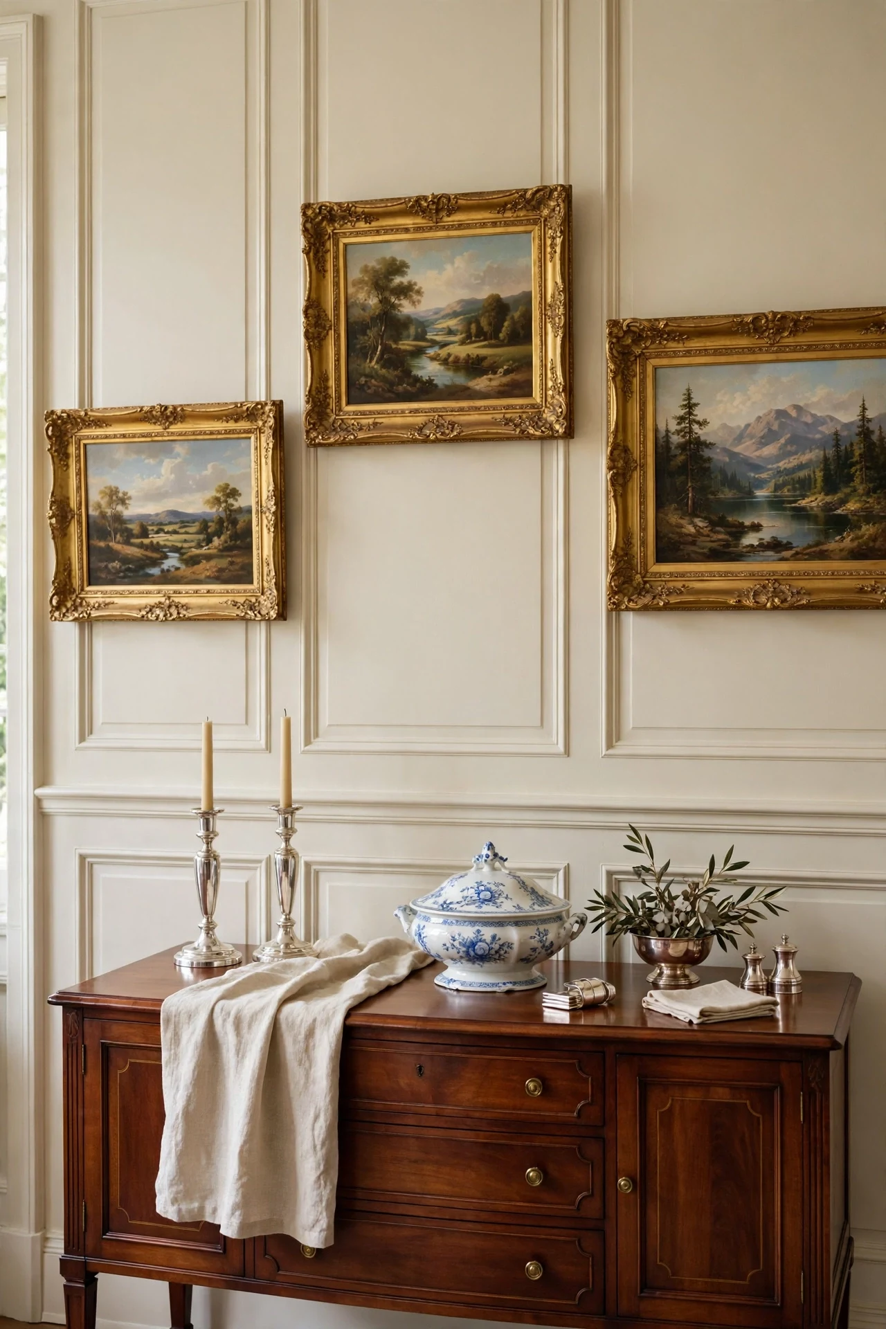
The wall feels collected, storied, and museum-calm.
Gilt frames repeat the room's brass tones at picture scale, linking art to architecture through shared metal. Hung above the rail, paintings gain a paneled plinth that lends each frame weight, like pictures in a paneled gallery — slight asymmetry keeps it human, not staged.
Hang art centered at sixty inches, or align frame bottoms with the chair rail for a tailored gallery line. Use brass picture hooks so frames sit off the wall and cast a soft shadow. Mix one large landscape with two smaller portraits per wall section.
💡 Quick Win: Rehang one crowded wall with wider spacing this afternoon and let each frame breathe against the panels.
17. Full-Height Panels in a Tiny Powder Room
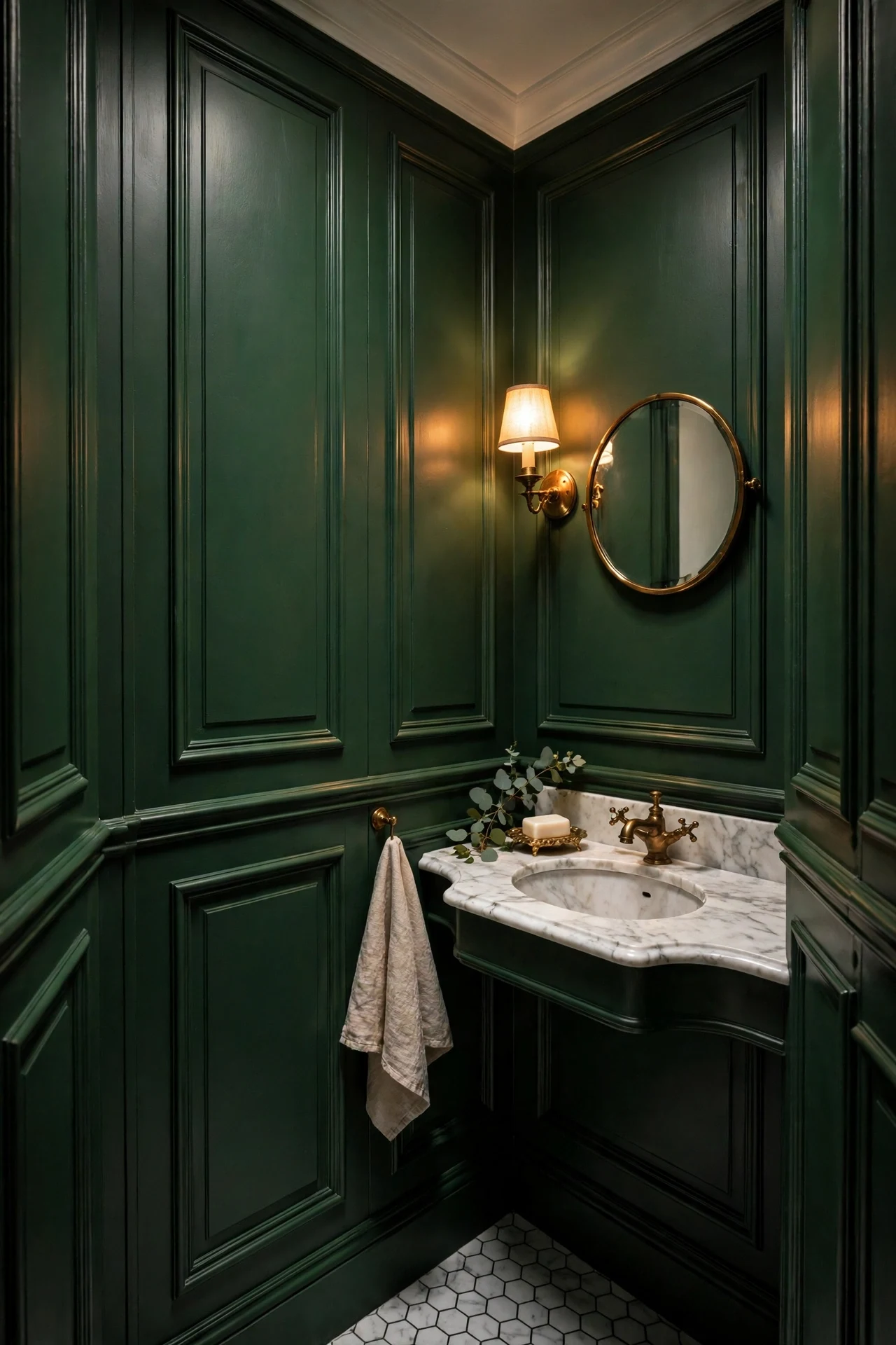
The powder room feels jewel-box, dramatic, and entirely its own world.
Panels run to seven feet borrow height — vertical lines pull the eye up, so the ceiling feels taller than its tape measure. Deep green concentrates visual weight low and around, which reads as embrace rather than squeeze in a room visited briefly.
Stack two tiers of raised panels to a cap at eighty-four inches, keeping boxes narrow for a quick, lively rhythm. Use moisture-resistant MDF and silicone every seam against steam. Finish in deep green satin with one small brass mirror to double lamplight.
18. Soft Cream Double-Height Panels in a Grand Foyer

The foyer feels airy, stately, and quietly ceremonial.
Double-height panels work on pure proportion: stacked boxes double the wall's rhythm, so a two-story void reads composed instead of cavernous. Soft cream reflects daylight down from the transom and up from the floor, keeping tall spaces luminous rather than looming.
Run two panel tiers with the rail at thirty-six inches and a picture molding at eighty-four, stacking a second tier to the ceiling line. Paint everything in Benjamin Moore White Dove satin so tiers read as one carving. Center a large brass lantern in the void.
💡 Quick Win: Paint your existing foyer panels one shade lighter this month and watch the whole entry lift.
19. Polished Nickel Rail Caps and Door Furniture
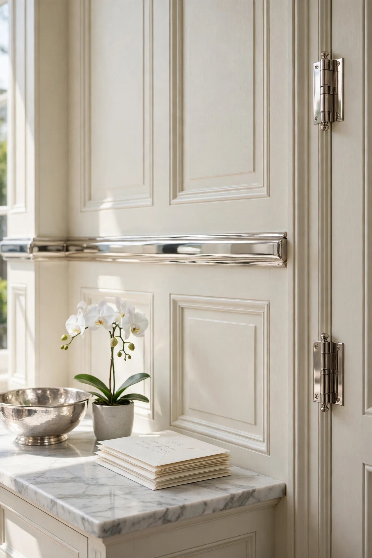
The vestibule feels cool, gleaming, and precisely tailored.
Polished nickel draws a mirror-bright line along the chair rail that sharpens every profile it touches — one reflective edge making adjacent matte surfaces look deliberate. Against warm cream, nickel's cool shine is the temperature contrast keeping traditional rooms from feeling sepia.
Fit a polished nickel cap strip along the chair rail, matching it with nickel hinges, hooks, and switch plates for one metal story. Keep panels warm white so the cool metal has something to play against. In humid rooms it outlasts unlacquered brass.
20. Candlelight Dinners Against Paneled Walls
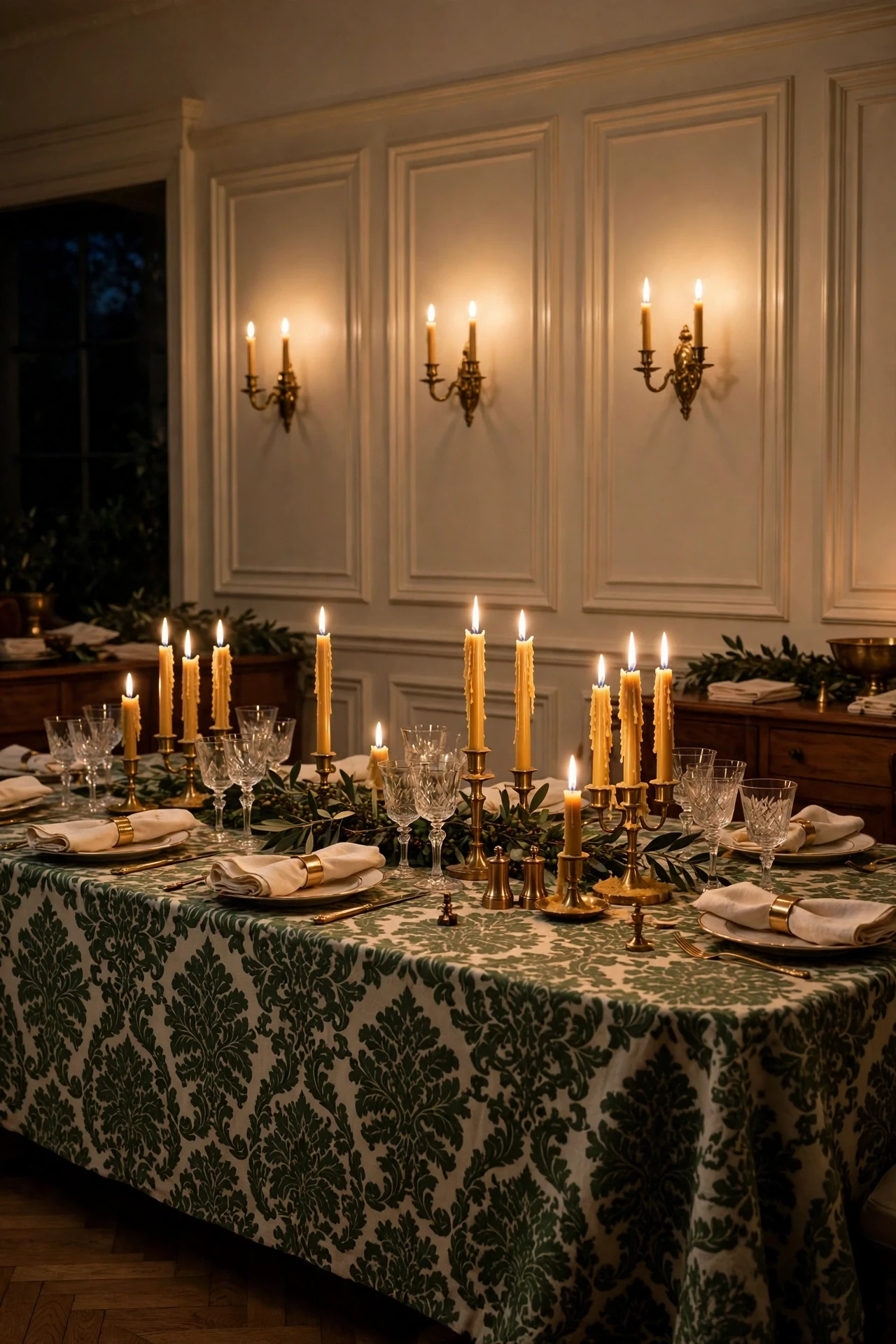
The dining room feels flickering, intimate, and outside of time.
Live flame at roughly 1800K deepens every color and sets bevels dancing with moving shadow — dynamic light no bulb can fake. Clusters of tapers at varying heights create a glowing horizon echoing the chair rail, so the room feels alive rather than merely lit.
Group beeswax tapers in solid brass holders on sideboard and table, mixing three heights for a natural skyline. Kill the overheads and let two low sconces hold the room's edges. Use drip-proof bobeches to protect the damask; beeswax smells faintly of honey.
💡 Quick Win: Light a cluster of five tapers at your next dinner and turn off every overhead — the panels will do the rest.
21. A Canopy Bed Against a Paneled Bedroom Wall
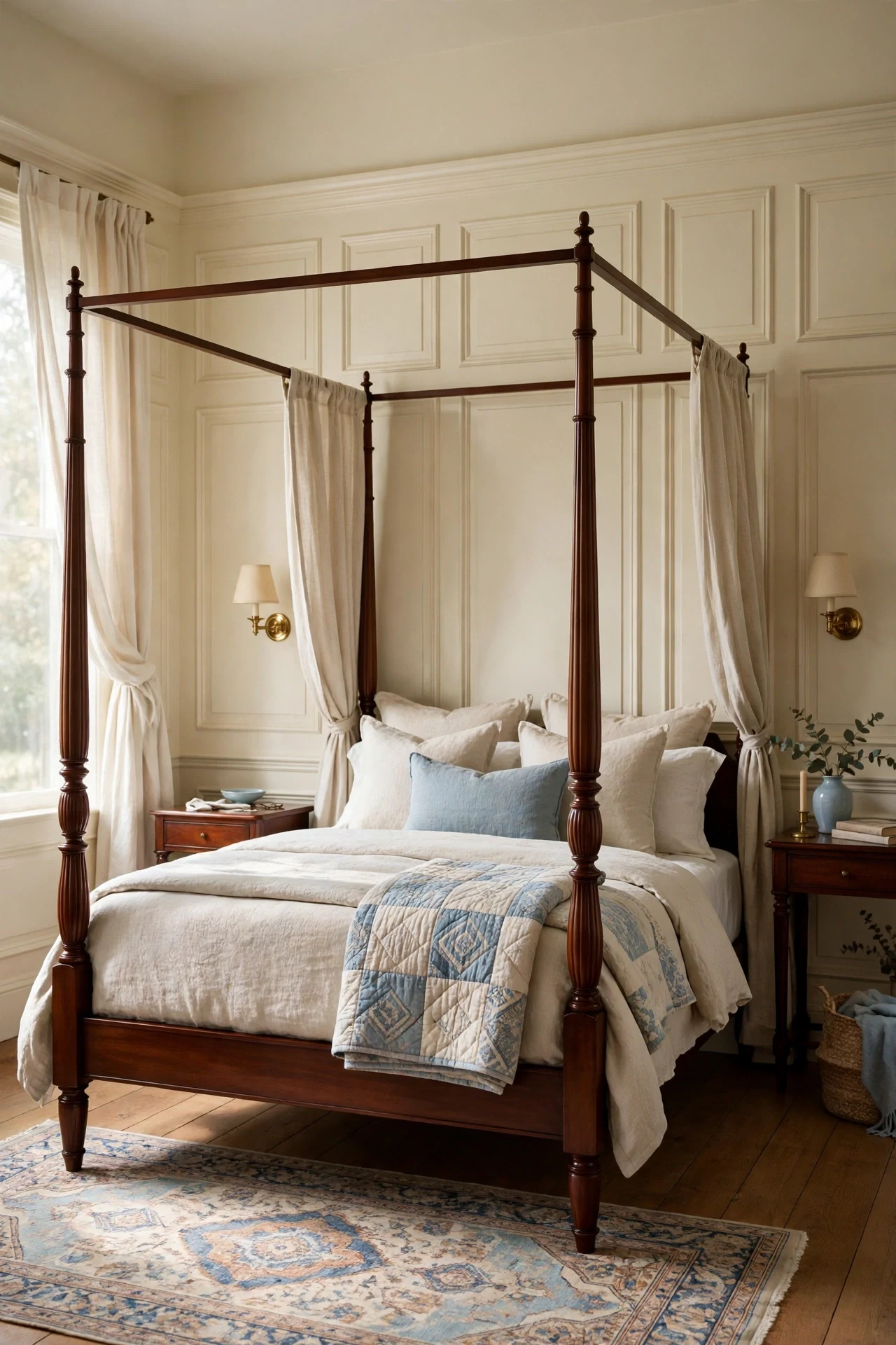
The bedroom feels sheltered, serene, and quietly grand.
A paneled wall behind a canopy bed reads as a headboard the size of the room, giving the bed a backdrop with real presence. Vertical stiles echo the bedposts — repetition settling the composition like rhyme settling a verse. Boundaries that hold without closing in: exactly what bedrooms need.
Run raised panels the full wall behind the bed to eight feet, centering the bed on the middle box for strict symmetry. Keep a soft cream satin so morning light models bevels without glare. Mount brass reading sconces on the flanking stiles with bedside dimmers.
22. Boxwood Topiary in Brass Urns
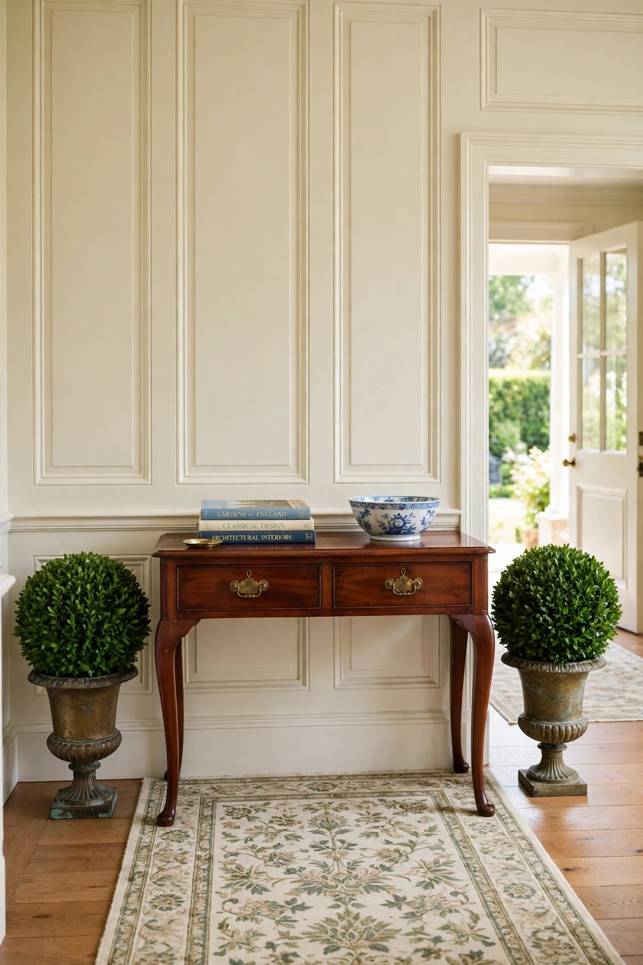
The foyer feels fresh, sculptural, and garden-formal.
Clipped boxwood repeats panel geometry in living green — spheres answering rectangles — a dialogue between organic and architectural that keeps formal rooms from stiffening. One living color against cream and brass reads intentional, where none would read flat.
Place matched topiaries flanking a console or door in aged brass cachepots echoing your sconces and hardware. Water weekly and rotate monthly for even growth. In low light use preserved boxwood, which holds color for years without watering.
💡 Quick Win: Set one small boxwood ball in a brass pot on your console today for instant garden formality.
23. Tonal Cream-on-Cream Panels and Walls
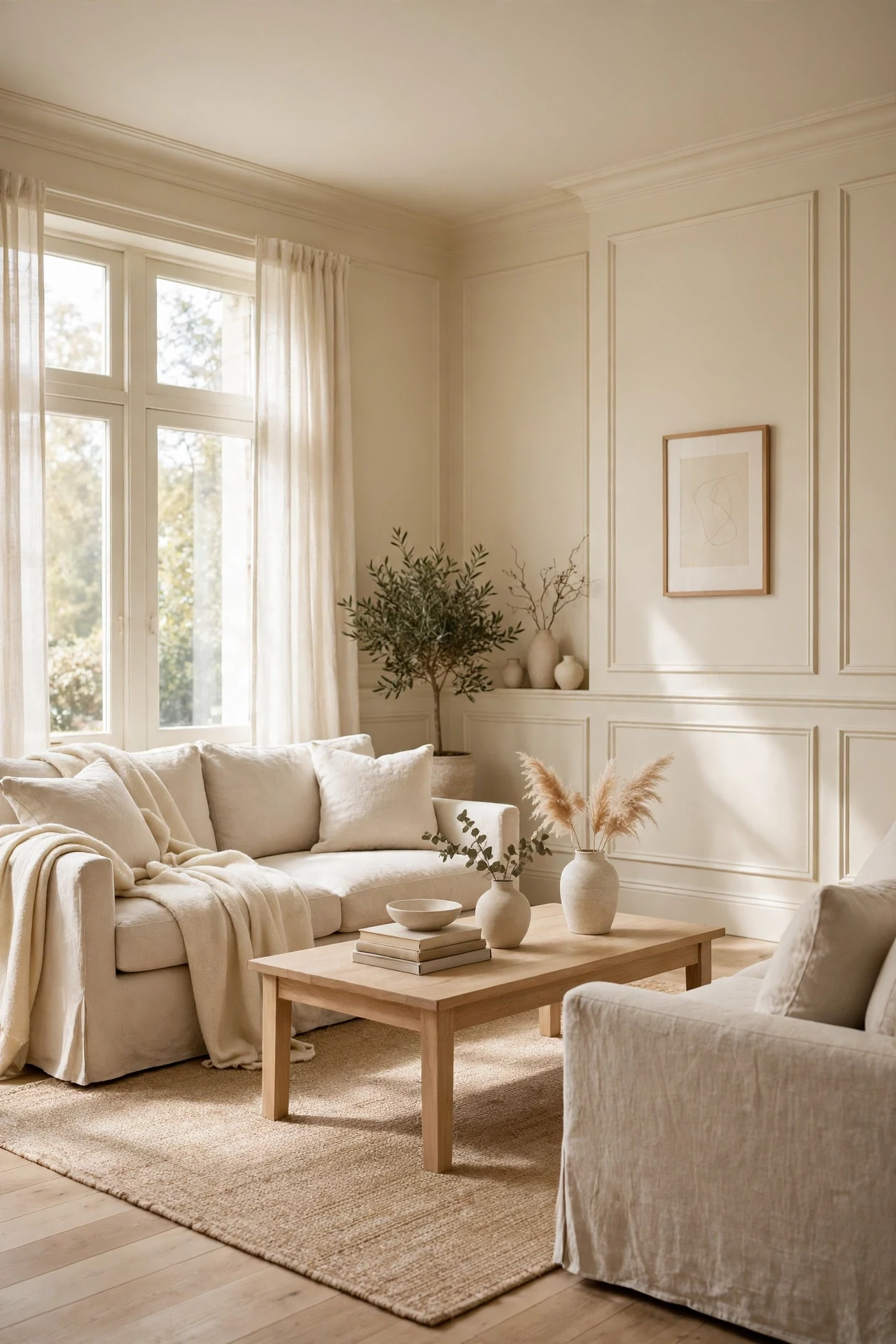
The room feels quiet, seamless, and washed with light.
One cream in two sheens creates depth without contrast — flat above absorbs light, satin below returns it, so bevels model themselves in pure tone. Tonal layering reads expensive because it whispers, and without color boundaries the room's proportions stay fluid.
Apply Benjamin Moore White Dove flat above the rail and satin on panels and trim; the sheen change alone draws the architecture. Keep furnishings in the same family — linen, pale oak, undyed wool — so the room holds its hush.
24. Staircase Wainscoting That Climbs With the Stair Pitch
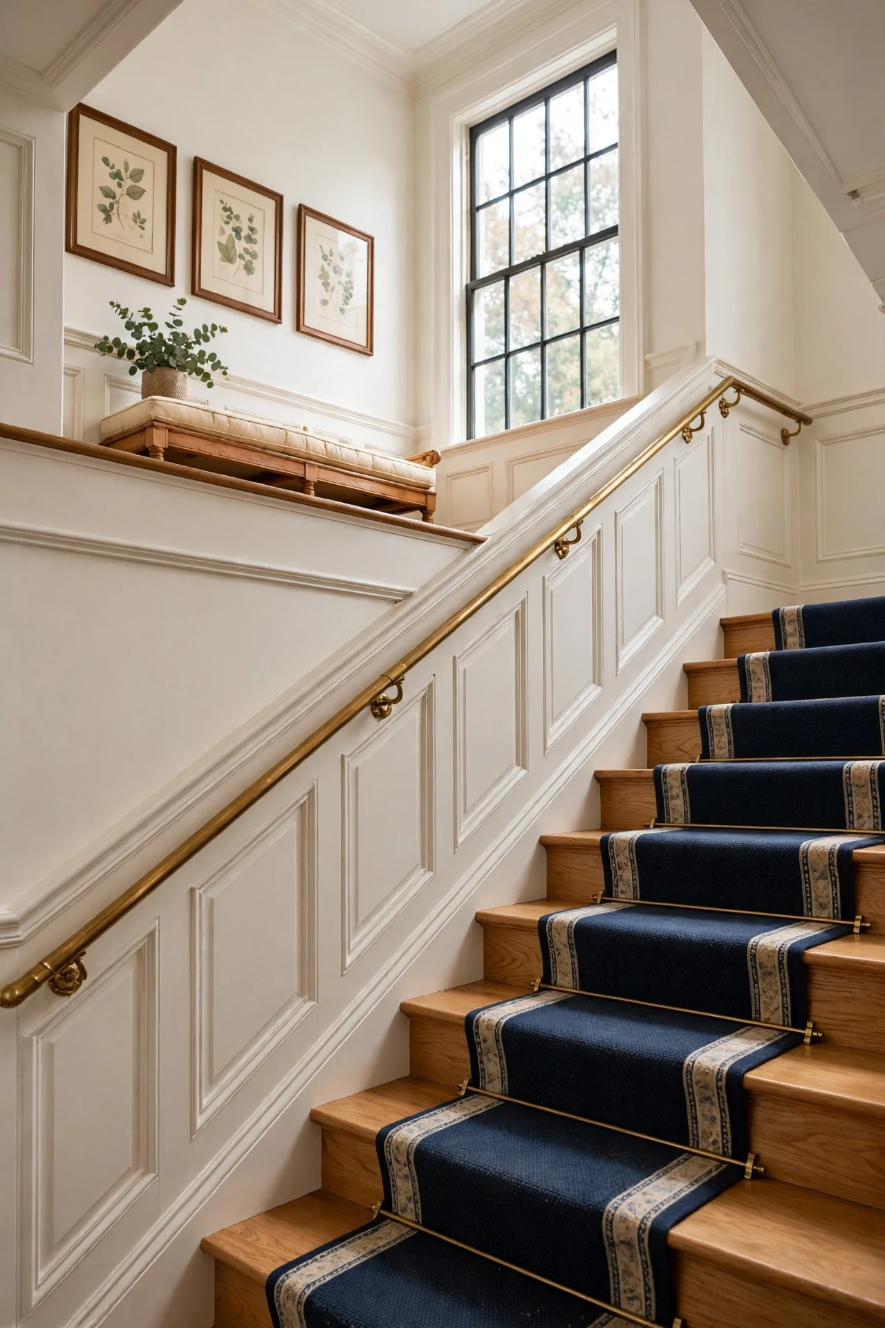
The staircase feels ascending, rhythmic, and thoroughly architectural.
A rail raking at the stair's pitch turns the wall into a diagram of movement — panel tops stepping upward like notes on a staff. Directional line pulls the eye up the stair, making the ascent feel shorter and grander; raked panels make stairs ceremony, not utility.
Measure the stair angle with a digital level and rip the chair rail and baseboard to that pitch before fitting. Keep panel boxes square to the rake so rectangles tilt honestly with the stair. Run a bordered runner in deep navy or red to echo the ascent.
💡 Quick Win: Paint your existing stair wall one deep color this weekend to fake paneled depth while you plan the real millwork.
25. Painted Panels with a Hand-Rubbed Umber Glaze
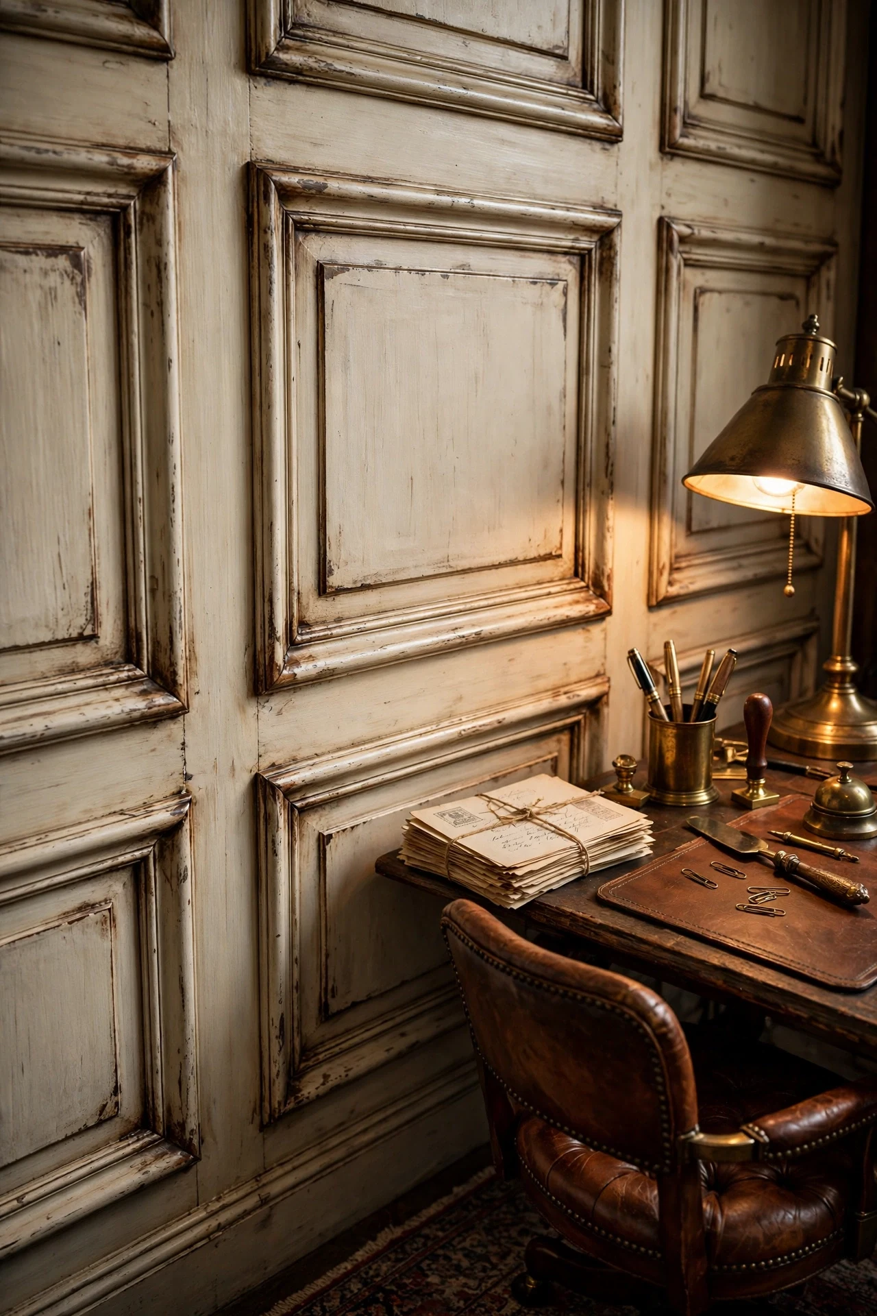
The study feels aged, artisanal, and full of quiet history.
Hand-rubbed glaze settles into bevels the way two centuries of wax and touch would — accelerated aging by hand, not factory. Umber darkening in crevices deepens every shadow line so panels read carved, and a dead-flat topcoat kills modern shine to sell the illusion.
Paint a cream satin base, wipe thin umber glaze over it, then work it back off the flats leaving it only in bevels and joints. Seal with dead-flat water-based varnish. Practice on spare molding first — five minutes of open time, not fifty, decides everything.
26. High-Gloss Lacquer Traditional Wainscoting Ideas for Drama
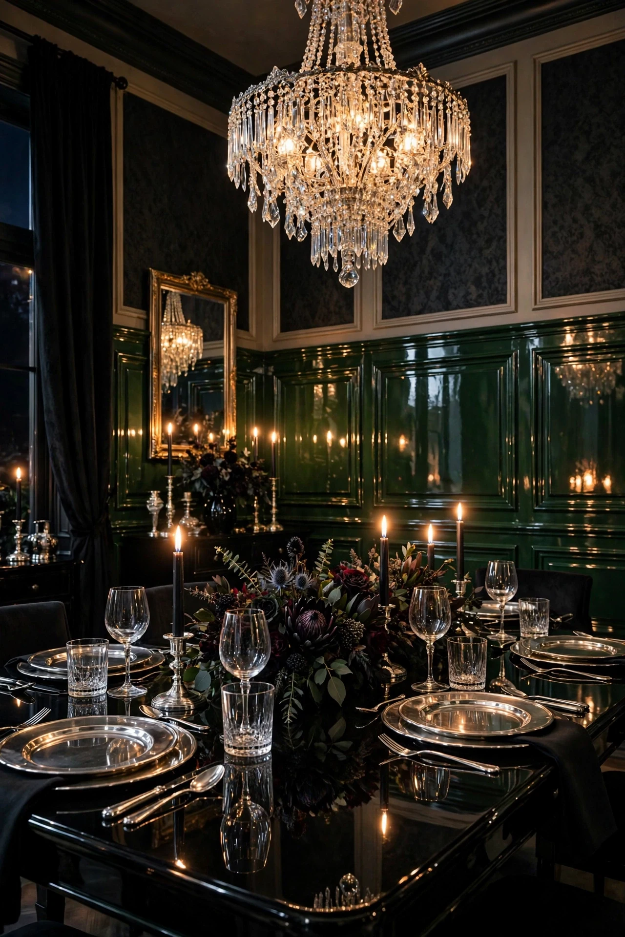
The dining room feels lacquered, jewel-like, and unapologetically dramatic.
High-gloss lacquer doubles every light source — each candle flame reflects in the panels, so walls glow rather than just the table. Specular reflection becomes the ornament, which is why lacquered rooms need almost no art; deep green in full gloss reads like enamel.
Spray three thin coats of high-gloss enamel such as Benjamin Moore Advance, sanding with 320-grit between coats for glass-smooth build. Cure thirty days before leaning furniture against it. Reserve full gloss for dining rooms and powder rooms, where scuffs stay minimal.
💡 Quick Win: Paint one door in high gloss this month to preview the lacquered look at almost no cost.
27. A Round Pedestal Table Centered in a Paneled Dining Room
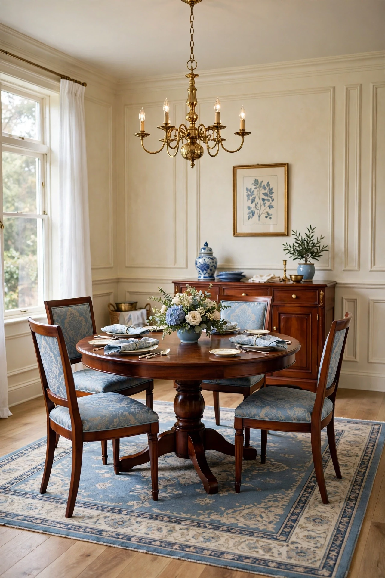
The dining room feels convivial, balanced, and effortlessly classic.
A round table inside a rectangular paneled room sets soft geometry against hard — the circle breaks the grid just enough to keep formality welcoming. The pedestal base keeps sightlines open to panels all around, so architecture stays visible from every seat.
Choose a sixty-inch round pedestal table centered on the room's middle panel, chandelier directly overhead. Lay a bordered rug stopping short of the walls so panel bases stay visible. Keep the centerpiece low so conversation and panel views travel uninterrupted.
28. Silver Trays and Ironstone on the Chair-Rail Ledge
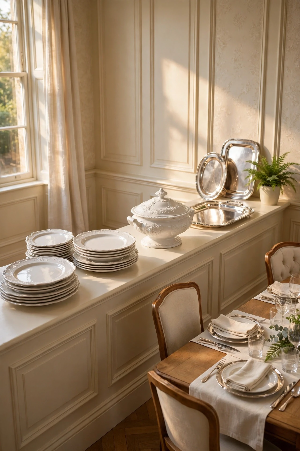
The dining room feels gleaming, collected, and ready for company.
A deep chair-rail cap becomes a display ledge — working trim where every molding earns its place twice. Silver trays leaned along the rail catch window light and throw it upward, a quiet light behavior brightening the whole room, while ironstone adds calm sculptural mass.
Specify a four-and-a-half-inch deep cap rail with a small thumbnail edge so objects sit securely. Lean two or three silver trays at a slight angle, stacking graduated ironstone platters between. Polish silver twice yearly; soft tarnish between suits the room's age.
💡 Quick Win: Lean one silver tray on your existing rail today and watch the wall come alive.
29. Morning Window Light Raking Across Foyer Panels

The foyer feels luminous, crisp, and still as a held breath.
Low morning sun striking panels at a shallow angle models every bevel in long shadow — raking light, the free architecture no fixture can fake. For one hour the millwork performs and the room needs nothing else; orientation becomes design, not just furniture placement.
Dress east windows only in sheer linen, which diffuses without blocking low rays. Leave the foyer uncluttered until ten so the light has a clean stage. When planning new panels, mock up on the sun-struck wall first — north halls deserve deeper color instead.
30. White Oak Herringbone Floors Under Cream Panels

The living room feels grounded, warm, and built to be inherited.
Herringbone oak under paneled walls sets two geometries in conversation — floor zigzag against wall rectangles, pattern answering order without competing. Two quiet patterns at different scales enrich a room the way harmony enriches melody, and pale oak warms cream panels from below.
Install unfinished white oak herringbone finished with matte hardwax oil, which keeps wood pale instead of ambered. Keep area rugs low-contrast so the pattern reads through. Run the herringbone at forty-five degrees to the paneled walls for the traditional-correct layout.
💡 Quick Win: Lay one herringbone-patterned rug over your existing floor to preview the geometry before committing to wood.
31. Tall Slim Panels in a Narrow Hallway
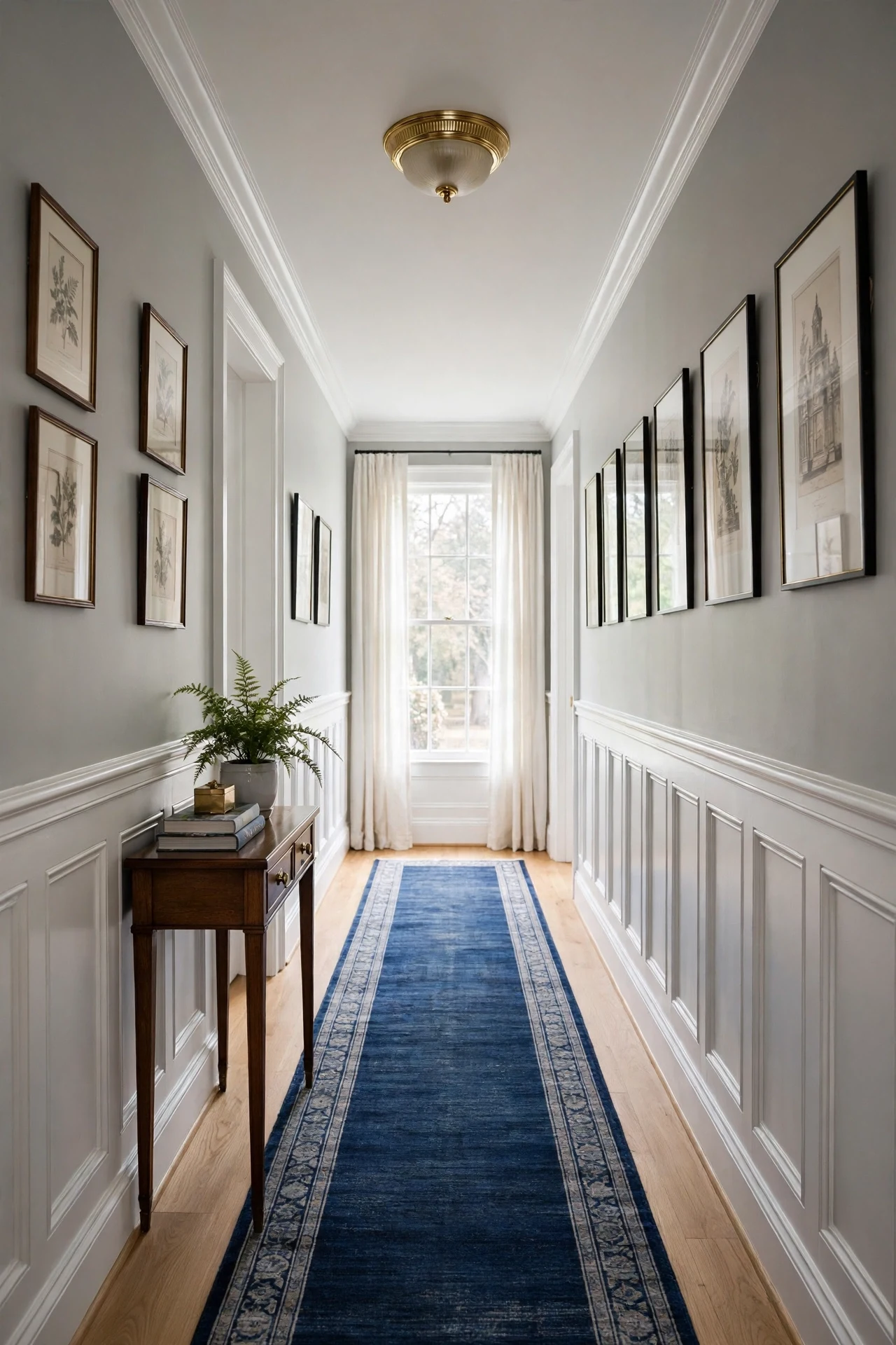
The hallway feels elongated, calm, and tailored like a good suit.
Tall narrow boxes borrow height through vertical emphasis — the eye climbs the slim rectangles, so a seven-foot hall feels a story taller. Pale paint pushes walls outward visually while the forty-two-inch rail keeps proportion adult rather than dollhouse.
Build boxes ten inches wide with the rail at forty-two inches, keeping projection under half an inch so shoulders never brush. Paint everything in Benjamin Moore Simply White satin for maximum light return. Hang small etchings above at a consistent height.
32. Two-Tone Traditional Wainscoting Ideas: Cream Below, Green Above
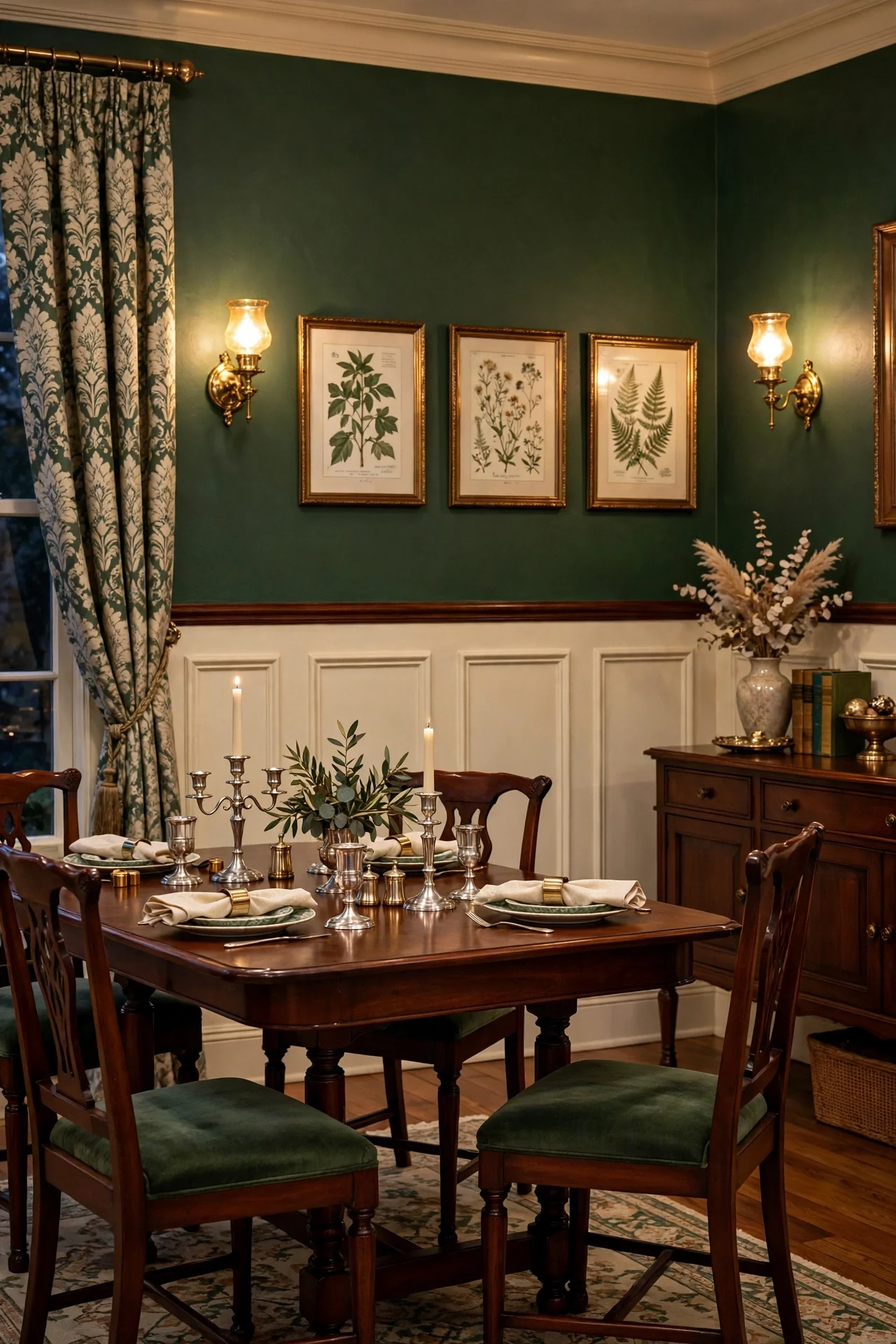
The dining room feels layered, heritage, and quietly daring.
Pale panels below and deep color above invert expectation — the green upper field acts as a backdrop making art and brass glow. Controlled surprise keeps classic from reading predictable: tradition in the millwork, delight in the color, with the rail line as the room's signature.
Paint below the rail in Benjamin Moore Simply White satin and above in Essex Green flat, cutting the line with a laser level and fine tape. Sheen contrast adds depth — satin catching lamplight below, flat receding above. Hang botanical prints where green gilds every frame.
💡 Quick Win: Paint one upper wall green above your existing white panels this weekend for the two-tone effect at half the work.
How to Start Your Traditional Wainscoting Transformation
Start with paint. Benjamin Moore Simply White in a satin finish creates the tonal foundation that makes every piece you add afterwards feel intentional rather than random, because warm white flatters both mahogany and brass while staying bright in weak light. Paint your existing baseboards and one wall's worth of applied panel molding in it, and the room will immediately read more finished.
The most common mistake is choosing a blue-leaning white, which turns cold and clinical once shadow lines multiply across the bevels. Traditional panels need a white with warmth in its bones; test your sample on an actual paneled section and view it at dusk, when cool undertones betray themselves. If it looks grey at 6 p.m., it is the wrong white.
Three items under fifty dollars create immediate impact: a quart of Benjamin Moore Simply White sample paint with a two-inch angled sash brush for crisp bevel edges, a solid unlacquered brass door knob for your most-used interior door, and a pair of battery-powered brass picture lights to wake up one paneled wall tonight.
A single paneled wall takes one weekend and roughly $150–$300 in paint-grade molding and paint for a starter version. A full dining room usually runs $600–$1,200 in materials and two to three weekends, while mahogany panels, professional spraying, and hardwired sconces push timelines toward a month and budgets well beyond.
Frequently Asked Questions About Traditional Wainscoting Ideas
What is the difference between traditional wainscoting and modern wainscoting?
Traditional wainscoting uses beveled raised panels set inside stiles and rails, with a distinct chair rail and baseboard, descended from Georgian and Federal interiors. Modern wainscoting usually means flat applied molding boxes or simple battens on drywall, with minimal profiles and often a single paint color carried wall to ceiling. Traditional panels cast real shadow lines and suit formal rooms; modern versions read as quiet texture. Choose traditional when you want ceremony and depth rather than minimal calm.
What colors work best with traditional wainscoting ideas?
Warm whites lead: Benjamin Moore Simply White and White Dove keep panels bright without turning clinical. For drama, deep forest green like Benjamin Moore Essex Green and true navy like Farrow & Ball Hague Blue are the heritage choices, especially in dining rooms and libraries. Soft creams suit foyers and bedrooms where light matters most. Always test on an actual paneled section, because bevel shadows deepen every color by nearly a full shade.
Is traditional wainscoting expensive to achieve?
It can start very affordably, because applied raised-panel molding over flat drywall creates the traditional look without solid timber panels. Paint-grade poplar molding for one wall typically costs $80–$150 plus paint, while a full dining room in materials runs $600–$1,200. Real mahogany panels and professional installation cost several times more. Unlacquered brass hardware adds a modest premium per door, roughly $25–$45 per knob.
Can I mix traditional wainscoting with other styles?
Yes, painted traditional panels are historically neutral enough to sit with transitional, coastal, and even restrained modern rooms. Keep the profiles classic and repeat one material, such as unlacquered brass or Belgian linen, to link the styles together. In modern spaces, paint panels the same color as the upper wall for quiet architectural texture. Avoid pairing ornate raised panels with raw industrial elements in the same sightline, where the formality clashes with the roughness.
What lighting works best with traditional wainscoting?
Warm light at 2700K or below flatters traditional panels best, because it deepens bevel shadows instead of flattening them. Candle-style brass sconces at sixty-six inches, dimmable crystal or brass chandeliers, and small picture lights over art all graze the molding with flattering raking light. Avoid cool daylight bulbs, which turn warm whites grey and kill the patina on brass. Put sconces and chandeliers on separate dimmers so the room can drop to candlelight levels for dinner.
Ready to Bring These Traditional Wainscoting Ideas Home?
From Simply White dining rooms and forest green libraries to lacquered jewel-box walls and sun-raked foyers, these traditional wainscoting ideas ranged across color, materials, lighting, furniture, accessories, and layout. A transformation does not need a whole house at once; one well-painted paneled wall is the right and honest start. Today, tape a chair-rail line at thirty-six inches on your plainest wall and live with it until tomorrow morning. Once panel shadows start catching evening light, the room will feel warmer, older, and quietly settled in a way flat paint never achieves. Save your favorite traditional wainscoting ideas pairings, especially the color combinations, and plan your first wall from the pins you keep returning to.